Monday, May 17, 2010

Still Life: Red & Blue 2

Following the success of Red & Blue #1, I used the same props and 4-colour limited palette to do a second still life.

Oddly, this one threw some unexpected challenges at me. I had essentially completed the painting but for some reason, I could not get the small vase to look right - despite painting it twice. Once again it was looking like I should take up golf instead (do all artists think like this?).

I knew the composition worked and I was happy with the overall colour concept but the vase had to go. So I grabbed a painting knife and scraped off the vase and background. I never used to do this with my disappointments - I just "added them to the pile" - but if the overall composition is working, scraping is a very useful technique.

A few swift scrapes across the surface with the long side of the knife leaves an impression of the image behind in the primed surface, even on a smooth panel like this one (primed MDF). The ghosted image acts as an underpainting so from this point all attention can be focussed on colour rather than layout.

I took a photo of the setup and did a 20 minute painting in Photoshop.

(Red & Blue #2 - digital. 720x520px. © 2010, Andy Dolphin)

This was enough to convince me I did have some vague idea of what I was doing - I just had to make the paint do what I wanted it to do.

So the next day I took to the painting again and I think I got it right this time. Phew!

(Red & Blue #2, 20x24cm oil on panel. © 2010, Andy Dolphin)

Golf can wait until another day.

Friday, May 14, 2010

Still Life: Red & Blue 1

After playing around with Photoshop and making a small still life digital painting of an apple last week, I decided it was time to bite the bullet and give real still life another go. It's been a long time since I've done it.

I had to search around for a working lamp and clear a corner to set up a basic shadow box (actually a towel draped over an old easel and a bunch of storage boxes stacked to make the table top with a piece of clear acrylic on top for a reflective surface).

Then I had to decide what I was going to paint. This is where I usually stop because nothing seems remotely interesting. I sorted through some junk I bought three years ago - for doing still lifes - and found a wonky ceramic vase. I snipped some bright red chrysanthemum flowers (lucky Mother's Day was last Sunday) and set them up under the lamp.

It didn't look too bad so I grabbed one of my primed 20x24cm canvas panels and began.

Here's the result after a couple of hours. Click for a bigger pic.

(Red & Blue #1, 20x24cm oil on canvas panel. © 2010, Andy Dolphin)

A few minor things bug me, mostly related to the process, but all in all I'm pretty pleased with it. With winter only a few weeks away, I think I'll be doing a bit more of this.

I used a limited palette of ultramarine, crimson and cad yellow light. This was fine until I came to put the bright red highlights on the outer florets. Mixing crimson and yellow just didn't cut it so I put some cad scarlet out and used that for the warmest reds. Still, four colours plus white is limited by most standards.

Sunday, May 9, 2010

Perfect plein air afternoon

I left my "day job" early on Friday afternoon and set off to find something to paint. The heavy cloud cover we had earlier in the day had cleared leaving almost cloudless blue skies, no breeze and warm sunshine.

I drove toward Albany's Princess Royal Sailing Club, checking out every little side street that looked like it might get me close to the water. Eventually I found the perfect spot - a spectacular view, quiet street and almost 100% shade from a small tree.

It was around 3pm when I started painting. This meant the light wasn't going to change dramatically but it also meant the light was a little cool. I anticipated the light getting warmer as the sun lowered and I began painting with a rough compositional wash of Australian red gold to get rid of the white gesso.


The yachts at the sailing club seemed like an obvious focal point but the water was mirror-flat and the reflection of the distant trees was what really caught my attention so that's what I was going to focus on. The boats can wait until another day.

Wary that a breeze might come in any time and change everything, I made sure to get the reflection worked out before I spent much time on other areas. The sky wasn't likely to change much and the trees would just get warmer but with the sun over my left shoulder, the shadows wouldn't shift around enough to worry about.


View to Princess Royal Sailing Club. 
20x24cm oil on panel. 
 © 2010, Andy Dolphin
SOLD 

I was standing on the verge beside a suburban street and soon attracted the attention of local residents who walked over and chatted with me as I painted. Some artists are put off by this but I quite enjoy the interaction. I used to be a signwriter and soon got used to people wanting to ask questions as I painted shop windows and walls. Traditional signwriting (with paint, brushes and a mahl stick) is just one of those things that attract the public's attention - especially the mahl stick for some reason! It often seemed that every third person would ask "what's the stick for?" I often joked about getting a t-shirt printed on the back with a picture of a mahl stick and the words "it's for resting on!" The other public favourite was "why did you bother laying out where the letters should go if you're not going to follow your layout?" Never a dull moment.

Plein air painting seems to share that public fascination so it's worth coming to terms with it if you're going to paint in public places - of course it helps if the painting is going well at the time and if the people are pleasant and don't tell you your initial wash in doesn't look the right colour or something.

Sorry, drifted off track a bit there. So anyway, people were watching and chatting with me while I painted but I was especially surprised when it turned out one lady in the growing group already owned two of my paintings! We'd never met before and she had no idea who I was until she mentioned "Andy Dolphin" in conversation. Small world. Cue Twilight Zone theme music now....

To top it all off, I was happy with the image I'd captured and the real scene took on a whole new quality as I was packing up - one of those fleeting displays of subtle pinkish-lilac light that we'd all love to capture if we could paint fast enough. It lasted less time than it took to pack up but I snapped a photo of it for future reference. The breeze still hadn't come in by the time I drove away.

I'm going back one day and see what else this spot has to offer. I wonder what the odds are that I'll get another sunny afternoon with no breeze? It was a perfect afternoon.

Here's a bonus picture. It's another digital painting done in Photoshop. This is pretty much how I recall the colours as I was packing up my painting gear. Click on the image to see an almost full-size version.

(Princess Royal Sailing Club - digital. 1220x520px. © 2010, Andy Dolphin)

Saturday, May 8, 2010

More digital painting

After my digital apple painting from a couple of days ago, I thought I'd try a digital landscape painting in Photoshop.

I've tried painting landscapes in Photoshop before but without much joy. This time I approached it just like an oil painting. I laid down a warm undertone across the whole "canvas". Then I sketched in a simple composition then placed my major dark tones using a coarse, square stipple brush with opacity and dual brush pressure settings.

Then I adjusted shadow colours and laid in the local colours. There was quite a bit of to-ing and fro-ing from here with small adjustments to shadow colours and tones.

I used the smudge tool with a size and pressure setting  to apply a cross-hatching finish that gives the piece a pastel feel, I think. I may have overdone it a little but I'm just trying things out here to see what works and what doesn't.

To do this sort of thing you need a pen and tablet to access the brush pressure tools. It is also far easier to draw with the pen than with a mouse. It becomes quite natural very quickly. I have a small Wacom Graphire 4 tablet and Photoshop CS on a G5 Mac  - I don't use a mouse for anything.

Click on the image to see it at full size.

(Driveway with trees - digital painting, 720x520px. © 2010, Andy Dolphin)

I did a limited-palette plein air painting of this scene last week but this digital piece was done from a photo with a bit of artistic licence thrown in as the photo didn't really do the scene justice and my plein air piece was from an hour earlier when the light was cooler and the sky still blue.

This tiny digital painting took longer than the original plein air piece - about two hours. With both paintings to work from, I think I'll do a larger oil painting soon.

Thursday, May 6, 2010

Digital painting for fun...

I've been reading a lot of Carol Marine's excellent art blog lately and am inspired by her fruity still lifes in oil. Tonight I discovered Michael Naples' blog and was captivated by his still lifes too.

Then just for fun I opened Photoshop and started messing around, showing the kids some of the brush tools and the effects that can be achieved with them.

I very rarely do still life (I think I've done five in ten years) but I ended up with this apple painting, done without reference. I'm pretty pleased with it.

(Green apple 1. Digital painting, 520x520px. © 2010, Andy Dolphin)

Canola Shadows - finished oil painting

Here's the finished piece from yesterday's article "Up-sized canola painting".

(Canola shadows. 70x37cm oil on panel. © 2010, Andy Dolphin)

At my wife's suggestion I added more detail to the foreground. This is always a bit of a juggling act - adding enough detail to keep it interesting but not so much that it becomes a focal point. As such I've kept the detail deliberately soft and unsaturated. Still, it's difficult to go back in on a painting that you considered finished.

(Canola shadows - detail. Oil on panel. © 2010, Andy Dolphin)

Here's a close-up of the focal tree. As often happens, now that I've seen it cropped like this I see potential for a whole new painting. 

Wednesday, May 5, 2010

Up-sized canola painting

I posted a step-by-step mini demonstration of  this small studio study back in early March.

painting in oil australian landscape step by step andy 
dolphin
Sunlit Canola. 
20x24cm oil on panel.  
© 2010, Andy Dolphin
SOLD

This week I decided it was time to do a bigger - and wider format - version of it.

Working on a 70 x 37cm double-primed MDF panel, I laid out the basic composition with a thinned out mix of ultramarine and crimson. Even at this very early stage there's a sense of distance and sunlight.


Next comes the washing-in of undertones with thinned colour and a one-inch pastry brush. After all tones are washed in I soften them with a gentle swish of the cleaned pastry brush.


At this stage things should hold together well through squinted eyes. If nothing is wrong compositionally and if all tones sit well with each other, preserving a sense of distance, I begin laying down final colours. I work from the sky down, moving "forward" through the landscape increasing colour saturation and contrast as I go.

In this case I felt the highlighted strip was too low as it ran almost centrally through the image space. Click on the image and squint at it to see what I mean. So I adjusted all the undertones upwards a couple of centimetres (about an inch) before moving on to the final painting process.

(Canola shadows. 70x37cm oil on panel. © 2010, Andy Dolphin)

Here's the finished piece. I deviated a little from the smaller study. The biggest difference, other than the wider format, is that I kept the sunlit strip of canola a cooler yellow. It's pure cadmium yellow light over a neutralised green. I'm happier with this because it's how I perceive it when I'm driving around in spring. The shadowed canola is also a less saturated green to increase the impression of it being in the shadow of a cloud rather than a different crop.

The major theme of complementary blue and yellow is still there. The distant blues help to make the sunlit yellow appear even brighter than it would be without it.

It's at this point that my wife takes a look and offers an opinion. She likes this one - except that she thinks the foreground needs a little more detail. Now it's at this point that I disagree with her and tell her it'll be fine. Then, two days later I look at the painting again - and decide that it needs a little more detail in the foreground. Sigh.

My wife's happier with it now so I'll post the finished, finished painting in a day or two when it's dry enough to photograph again.

Monday, May 3, 2010

Available works

I've received an email enquiring about what works I currently have available as those on my website are mostly sold.

I've been working on a new website for a while now - it's one of those do it yourself tasks and I tend to get bogged down in the nitty gritty of HTML and CSS and exactly what shade of grey a particular part of the page should be and what links I should include in the main menu and so on.

So in the meantime I thought I'd post a few of my available works here.

(Forest Road. 33x46cm oil on board. © Andy Dolphin @Boranup Gallery)

(Survival. 54x30cm approx - oil on board. © Andy Dolphin @Boranup Gallery)

(Equine Sunlight. 32x29cm approx - oil on board. © Andy Dolphin @Haese's Framers)

(Shoreline. 54x30cm approx - oil on board. © Andy Dolphin @Boranup Gallery)

Also available are the two shed paintings I mentioned last week in my "Highly Commended" article. Just drop a comment here if you'd like to know more. I currently have a larger version of my Sunlit Canola painting sitting on the easel. That should be available soon too.

Many of the small studies I've blogged about here are not currently intended for sale as they are personal exercises and may be used as reference in future studio works.

*Note: Due to the variability of browsers and monitors and the vagaries of photography, colours are not guaranteed to match what you see on screen but I have adjusted to be as true as I can make them.

Sunday, May 2, 2010

More autumn plein air landscapes

Thursday started out a little cloudy but by midday there was barely a cloud to be seen. It was also setting up to be a warm autumn afternoon so I threw the gear in the van and headed north toward the Stirling Range, the only thing in WA that looks like a stereotypical mountain range and home to Bluff Knoll, the highest peak in the southern half of the state.


At about 2:30pm, after lots of stops to check views and take photos, I happened upon this spot. It's not the most spectacular view but there was a shady spot off the quiet road where I cold stand comfortably and I wanted to experiment with a limited palette so I wasn't too fussed about finding "that perfect composition". I wanted something simple.

The palette for this painting was just three colours - French ultramarine, Australian red gold and burnt sienna plus titanium white. In hindsight it was an odd choice of colours because burnt sienna is essentially a dark red-orange and Australian red gold is basically a translucent yellow-orange. So I had two oranges and a blue to work with.

Burnt sienna was going to have to act as my "red" and Australian red gold as my yellow. As strange as the choice of colours might seem, I did consider the scene before me when making my selection. There were no strong, saturated colours. It actually worked pretty well, all things considered.

I must confess to scraping the top half of the painting when I got home, and repainting the sky and mountains a little lighter than I had on site. It happens like that sometimes. But I stuck with the same three colours.

(Sleeping Lady. 20x24cm oil on board. © 2010, Andy Dolphin)

This part of the Stirling Range is known locally as The Sleeping Lady, but only when viewed from roughly this angle. If I've captured it right, you should be able to see how it got that name.
 
I had a lot of trouble taking the photo of this painting. No matter what I did I got reflections. Sorry.

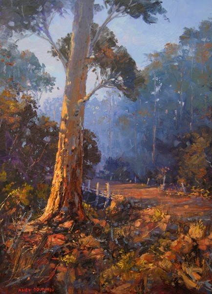
When I was done, I continued heading north-east, roughly parallel to the range. By now the sun was getting lower and things were looking more interesting. I found my second painting waiting for me a few kilometres up the road.


I also used a limited palette on this painting but I added cadmium scarlet since the sunlight was going to warm things up quite a bit. So I had French ultramarine, burnt sienna, Australian red gold and cadmium scarlet, plus titanium white.


(Driveway with trees. 20x24cm oil on board. © 2010, Andy Dolphin)

As predicted, the sunlight was warm and became warmer as I painted. I had a small battle deciding whether to keep adding warmth to the painting until I reached a point where I couldn't go any warmer without re-painting the sky and distant mountains.

The limited palette has its benefits and drawbacks. On the plus side, it cuts down on dithering over which colours to mix which helps to move things along a little faster. The aim is not so much to match exactly what you see but to focus more on tonal variations and warm versus cool. The limited palette also results in a more cohesive painting where all colours in the finished painting share common ancestors.

The downside is that some colours that might look important in the scene, such as warm, glowing highlights, might be impossible to mix even closely from the colours on your palette.

So if you're a colourist a limited palette might drive you nuts but if you're a tonalist it can be a joy. I'm usually somewhere between the two as I do aim for strong tonal contrasts but love to push saturated colours in sunlit areas. But the limited palette method will definitely be getting a workout from time to time in my plein air work.