Monday, December 19, 2011

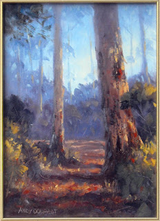
Gold Coast Hinterland - digital art

Just doodling in Photoshop tonight.

digital painting gold coast tambourine mountain qld
 Gold Coast Hinterland
1400x534px digital. 
© Andy Dolphin

This is somewhere near Tambourine Mountain. Painted from a photo taken in 2009.

Two in one night!

  Car in shade - Williams
600x560px digital. 
© Andy Dolphin

I spotted this car in Williams a couple of years ago, when I stopped for lunch. I did a pencil sketch of it on site but did this digital painting from a photo taken at the time. It's an unusual subject for me but something about the scene caught my eye. It feels very Western Australian.

Sunday, December 11, 2011

Shih Tzu Digital Painting

I haven't updated for a while because I haven't had much chance to paint but here's a little digital piece I did today.

The close-up format for this was actually inspired by Carol Marine's "silly face" series of paintings.

Shih Tzu.
500x500px digital.
 © Andy Dolphin
I might try the little guy in oils soon.

Wednesday, October 26, 2011

Tom Richmond Book!

The Tom Richmond caricature book I pre-ordered a couple of months ago arrived today, earlier than expected. Despite travelling half-way around the world, it arrived in perfect condition.


Tom's delivered 170 pages of in-depth instruction on the art of caricature. I've got a bit of reading to do now.

Sunday, October 23, 2011

Plein air mountain sketches in oil

Spring made a welcome return for a few days this week and I managed to get up early on Saturday morning and headed back out to the Stirling Range.

It was pretty hot for 6:30am, and there was very light cirrostratus cloud cover all morning. The light kept changing as I was painting, sometimes revealing subtle detail in shadows and sometimes obliterating it, but I was pretty happy with this one for a quick sketch.


(Sketch for Bluff Knoll Framed by Eucalypts. 35x25cm oil on board. © Andy  Dolphin)

I hope to develop this into a larger painting and to spend a bit of time resolving the tangled mass of bushland in the middle and foregrounds. The clouds look a bit contrived here but that's what they actually looked like at the time. It was quite surreal.

On the way home, I stopped on the side of the road and did a quickie of Mount Trio. I used a very limited palette of French ultramarine, cadmium scarlet and Australian red gold, plus white. The Aussie red gold makes the most amazing colour mixes and I'm still to work out how to predict them.

(Sketch for Mount Trio. 20x22cm oil on board. © Andy  Dolphin)

I hope to get back here at different times of the day and see what happens with those shadows on the peak.

Saturday, October 15, 2011

Bluff Knoll - Finally!

Bluff Knoll is the tallest peak in Southern West Australia. It lies in the Stirling Range and is about a one hour drive from my home.

Come this Monday, my family and I will have been in Mount Barker for eight years but in that time, I've been to Bluff Knoll only three times, and never for painting. I finally fixed that this morning.

I was up at 4:30am and, after cereal and coffee, I was out of the house shortly after 5am. I arrived at the Bluff Knoll car park around 6am.

We'd been promised a sunny day in the Great Southern but the Stirling Range creates its own weather and there was no shortage of cloud and a heavy veil of "atmosphere". Still, it was a pleasant, if slightly cool, morning so after scouting around for an interesting vantage point, I set up my easel and got to work.

When I began there wasn't much sunlight and I thought I was going to have to focus on the clouds drifting across the top of the bluff for interest. But as I was laying down my first washes, the clouds, mist and distant peaks took on a wonderful warm glow. There was my subject!

The light played hide and seek as I pushed on but I managed to get enough information down early on to capture the feeling. Here's the result after about one hour...

oil painting mountain plein air
(Sketch for Morning at the Bluff. 28x34cm oil on board. © Andy  Dolphin)

I used a limited palette of just three colours, French ultramarine, permanent crimson and cadmium yellow light, plus white. This helped to move things along a little faster although I did have a few moments of trying to mix the right shade of reddish, yellowish, bluish green-purple.

The light began changing dramatically with more foreground being lit with each passing minute - and each passing cloud. Finally I had to tell myself to "stop". I told myself two more times before putting the brushes away.

Here she is on location...


You can see how dramatically the light was shifting with absolutely no sunlight on the mountain in this shot. Luckily these "very grey" moments were few and far between, though they at least gave my eyes a rest when they came as I was looking almost directly into the sun.

Hopefully I can get a better photo of the painting when it's dry.

Monday, September 26, 2011

Updating blog

I'm in the process of giving the blog a bit of a freshening up. So forgive me if things look a bit weird occasionally as the only way to properly test changes is to apply them.

New painting studio

One of the reasons I haven't painted much for the last few months is that I've been trying to set up a new studio. The space I'm adapting is from an enclosed verandah that was here when we bought the house. Part of that room was demolished to make way for an extension to the main house and the half that was left is to be my art studio.

I installed a new Gyprock (plasterboard) wall a few weeks ago then painted all the walls in a slightly warmed, very pale grey. The existing walls used to be turquoise - almost the same colour as the door you see in the photo. I always painted in this space and I'm certain that the blue-green surroundings had an impact on the finished results.

The room also had an exposed sheet metal roof which made it very cold in winter and very hot in summer. I installed a suspended ceiling yesterday. Hopefully this will moderate the temperature a little.

It has two decent-sized, south-facing windows. We need south-facing windows in art rooms in the southern hemisphere so this was a bonus.


There's still quite a bit to do, including painting that hideous door a neutral colour, but at least it's starting to feel like a studio space now.

Saturday, September 24, 2011

Walk in Porongurup Range

I went into Porongurup National Park yesterday, my first visit for quite a while. I was with my daughter and her friend, on holidays from Wisconsin, and we soon set about following a trail past the "Tree in the Rock" to Nancy Peak. I'd walked part of this trail alone about six years ago but never made it to the top - mainly because I hadn't told anyone I was going there and I had no idea what to expect.

Yesterday, however, was perfect weather-wise and it turns out I'm fitter than I thought I was. After walking through the leg-aches on the lower slopes, we made it to Nancy Peak without too much effort. Once there, we checked the time and made the decision to keep walking and complete the circuit that would bring us back to the car park.

The next stage was quite rugged compared to the walk up to the peak. But it least it was all downhill from here, so it wasn't too bad.

Once at the top, there are aluminium trail markers bolted to the granite, so it's difficult to get lost. And seriously, it's a long, skinny, steep-sided range so there's really only two ways to go - east or west.

It was a sunny day with broken cloud cover. The views were spectacular. I did have a sketchbook with me but we were too short on time to stop and draw so I had to make do with photos. I'd like to go back with a pochade box or some other lightweight way to paint.

Anyway, here's a few pics.  The first three are the view from Nancy Peak and the last one is of the karri trees on the return journey through Wansbrough Pass.


The complete circuit is about 5-6km long. Nancy Peak is 490m high (650m above sea level).

If you're ever in the Great Southern (Western Australia), then you might want to give it a go (mid-Spring is perfect - the wildflowers are blooming). It turns out moderate fitness and a decent pair of shoes is okay for this trail. It took us about three hours, including pauses, to take in the views.

Saturday, September 17, 2011

Canola oil painting

I did this studio oil painting yesterday based on a plein air sketch I did in Porongurup last weekend.

Knight's Canola 
37x50cm oil on board. 
© Andy Dolphin
SOLD

 Here's a close-up of the brushwork on the flowers.


And here's the on-site sketch from last week.

Knight's Canola - plein air
20x22cm oil on board
© Andy Dolphin

Sunday, September 11, 2011

Latest oil paintings

Here's a painting I did last weekend. It's a bit looser than my normal style and I was interested in pushing the dark/light contrast whereas I'm normally playing warm reds and oranges against cool neutrals, with a focus on aerial perspective.

(Angus Evening. 30x70cm oil on board. © Andy  Dolphin)

And here's yesterday's plein air piece. I think this one will be repainted much bigger soon.

(Knight's Canola - plein air. 20x22cm oil on board. © Andy  Dolphin)

Once again, the photography is less than perfect. That's a problem I hope to solve soon.

Saturday, September 10, 2011

Spring Plein Air

Spring has finally arrived in the Great Southern and the canola is in full bloom all around us, so I took the opportunity to get out and paint. I was joined by Ted who's on holidays in the region. You can see Ted below, completing his first-ever plein air painting, with spectacular results.

Here's my effort completed using a limited palette of French ultramarine, cerulean blue, permanent crimson, cadmium yellow light and white...

We were painting well before sunset and the sky was clear, with no threat of clouding over, so I took a bit more time than usual. There's about an hour of work in this piece.

Long-time followers of the blog might recognise this tree from paintings I did at the same location last December. It's a great spot with a ready-made composition. I think I'll be painting here again.

I'll post a better photo of the finished painting soon, along with a studio painting from last weekend.

Friday, September 2, 2011

Self Caricature Sketch

I decided it was time to do a caricature of myself. This is somewhat worse than doing self portraits (and it's been many years since I did one of those) because a caricature requires the exaggeration of features, even the less-flattering ones.

Most of us are used to seeing ourselves in the mirror but mirrors don't give an accurate image. Not only are we in reverse, we are also, in my experience, slimmer, taller and less wrinkly.

This was an impromptu decision and there was no combing of hair, no shaving and no makeup - just a few reference photos snapped in the spring sun. So here I am in my natural, wrinkled, uncombed state - and exaggerated.

digital caricature of andy dolphin

This is just a quick digital sketch. I might work on it some more in the future.

Sunday, August 21, 2011

August Workshops

I did two workshops earlier this month - the first for Gallery 500 and the second for Albany Art Group. Here are the demonstration pieces I did in each workshop...

seascape workshop in oil

In this seascape, done with Gallery 500 at Terra Verde Gallery in Albany, I focussed mainly on translucent water and the colours required to make a convincing "white" in sunlight and shade.

landscape workshop in oil

I did this landscape with Albany Art Group. My main interest here was aerial perspective and shadow-sunlight contrast. The original is very warm as we were painting under mercury-vapour lamps which lean heavily toward blue-green and tend to suck the life out of reds and oranges. Consequently, there's a tendency to mix these colours more saturated than usual.

Monday, August 15, 2011

Quinninup Cow - Digital Painting

Another digital painting based on a photo I took earlier this year on the way home from Pemberton. I was particularly interested in the contrast of the sunlit "brick red" cow against all those cool, dark greens.

(Quinninup Cow. 1200x432px digital. © Andy Dolphin)

Sunday, July 31, 2011

Millie in Oil

I found some time and space yesterday to get some brushes wet. Here's the result.


This is the under-painting, done with thin mixtures of burnt sienna and French ultramarine. Animal studies like this require a little more care than landscapes and seascapes because it's too easy to "be wrong". If a tree branch is painted a little short or a wave a little too high, no one will know. But if the proportions of head, body and legs aren't right on a lamb, then most people will notice something is wrong, even if they can't identify what the problem is.

So I spent quite a bit more time on this under-painting than I would on any of my small landscape subjects. It doesn't look like much but there's probably 45 minutes work just in the under-painting.

(Millie. 20x22cm oil on board. © Andy  Dolphin)

This is Millie, one of our pet sheep. I did a digital painting of her last August, based on a photo I took a few years ago when she was only a matter of weeks old. This oil painting is based on that digital piece. I used a limited palette of French ultramarine, permanent crimson, burnt sienna, cadmium yellow deep and white.

Friday, July 29, 2011

I'm still here!

Things have been a bit quiet on the art front for me lately. I'm still without a practical painting space but progress on the studio is taking place - or at least, it was until I sliced the tip of my finger on some galvanised flashing (It's pretty minor but I'm trying hard to keep it clean) and now we have some severe weather happening so progress has halted - again. On top of this, my real job as been hectic for quite a while (cue the violins!).

I've got a couple of workshops coming up very soon. Next weekend, Saturday August 6, I have another workshop with Gallery 500 at their Terra Verde Gallery in Albany. By popular demand, I'll be revisiting seascapes in this one. The first three were great fun and the finished works were fantastic so I'm looking forward to seeing what we can produce this time.

The following week, Thursday August 10, I'm doing a workshop with the Albany Art Group and Vancouver Arts Centre.

army art logo from perth fremantleArmy Art is on again in Perth in a couple of weeks. I've entered two pieces and I'm hoping to travel up there and meet up with some of my old art friends.

This year's exhibition will be held at Leeuwin Barracks, Riverside Road, East Fremantle on Saturday and Sunday, 12th & 13th of August. All exhibited work will be for sale and part proceeds will benefit The Fremantle Foundation.

Sunday, June 26, 2011

Forest Workshop

I enjoyed another great workshop yesterday at Terra Verde Gallery in Albany.

The subject this time was a Karri Forest. These are not the easiest things to paint but, once again, everyone did a terrific job in the time available.

Here's a small (20x26cm) reference I painted last weekend...


It's a fairly simple design and not without its faults - like the small tree being too close to the centre of the painting - but it did the job as a reference sketch.

Here's my demonstration painting from the workshop (the photography on these isn't great). I used a limited palette approach on this one to simplify the process a little...

forest painting workshop in oil

The major lessons here include atmospheric perspective and tonal contrast. While our minds will usually read a karri tree trunk as being somewhat pale, or "beige", it is actually quite dark except where the sunlight hits. You can see this in the greyscale image below. Note how dark the trunk of the main tree is against the sky...


Tones are relative to surroundings so the smoother bark on the tree is lighter than the rough bark and the shadowed foreground shrubbery but quite dark compared to other parts of the painting. You can also see how the shadow-side of the smaller tree is virtually the same tone as the background yet it stands out quite clearly in the colour image. This is where temperature changes get to work to differentiate objects.

Getting these tones right, especially in seemingly busy scenes like this, can present a challenge to the uninitiated. To be honest, it still tests me.

This simple graphic demonstrates the concept. The small grey rectangle appears to change tone but it is in fact just one shade of grey all over. It is the changing tones surrounding it that affect our perception of it.


Is it any wonder tonalism is such a challenge when our minds play tricks like this on us?

Here's some pics of the workshop gang hard at work...


Thanks again to everyone for making these workshops so enjoyable.

Tuesday, June 7, 2011

June Workshop - Forest

Gallery 500 have invited me to do another painting workshop for them.

Workshops run for around four hours on a Saturday morning and students paint along with me as I break down my process of painting sunlight into easily managed stages.

The techniques demonstrated suit either plein air or studio painting. While I paint in oils, the approach works equally well for acrylics.

This month's subject will be "Karri Forest " and the date is set for June 25th.

If you're interested in attending, contact Brad at Gallery 500 in Albany, WA.

In the meantime, here's another digital "seascape"...

(Wave at The Gap. 1500x900px digital. © Andy Dolphin)

I wanted something a little different to the usual seascape vista with beach and sky so I focussed on a single wave breaking along the rock wall of The Gap, near Albany.

It's a long way down from the lookout platform to the water and it's difficult to judge scale when the only references are the water itself and the massive wall of rock. I'd estimate this wave to be around two-three metres tall - it could even be bigger.

I'm particularly interested in the various surface textures of clear water and foam.

Sunday, June 5, 2011

Before the Storm - Oil

Oil version of the digital painting I did a few nights ago.

(Before the Storm. 70x37cm oil on board. © Andy Dolphin)
SOLD

Thursday, June 2, 2011

Before the Storm - Digital Seascape

Following last weekend's seascape workshop, I had a taste for painting the sea, something I haven't done for a while.

Yesterday I grabbed my camera and headed to The Gap in Albany's Torndirrup National Park. This is a wild area where huge swells can appear without notice, even on the calmest of days. Yesterday was no such day.

As I drove down the road to the car park, I saw white water spouting up well above the rocks that top the gap. I'd never seen the water spray this high here before. I could also see towers of white water out to sea.

It was rough!

I wandered over the rocks from The Gap to The Natural Bridge and down toward the bay that lies to the west. The sea was white with foam, the air was wet with salt spray and the wind was whipping straight up the sloping rocks where I was standing taking photos. There was so much going on, and the waves were so much bigger than I've seen them here before, I didn't know what to take photos of... so I took photos of everything... lots of them.

I was wearing my sunglasses, not because it was bright - it was actually overcast - but to keep the salt out of my eyes. The scene was exciting but very grey, until I lifted my "sunnies". With bare eyes, there was a warm glow about everything except the deep water. The cloud cover was thin so the sun was having some effect.

Today I rummaged through the pics and borrowed bits from this one and that one to try and assemble a scene that conveys the feeling I experienced. From this, I did a digital painting in Photoshop...

(Before the storm. 2000x1057px digital. © Andy Dolphin)

I titled it "Before the storm" because there was a severe weather warning for later in the evening.

The painting is heavily influenced by the late E. John Robinson's famous seascapes. It's a style I've admired for years and I have his book "Paint the sea in oils using special effects" and two of his videos on the subject. His approach is sensible and straightforward. It makes a difficult subject much easier than it could otherwise be.

I hope to repaint this one in oils this weekend. I'll let you know how I go.

Sunday, May 29, 2011

May Workshop

I did my second workshop for Gallery 500 in Albany yesterday morning. It was nice to see some familiar faces from my landscape painting workshop, along with some new faces.

The subject this time was "Seascape" and I took the students through my approach to waves, flat water, rocks, sand, wet sand and, of course, sunlight and atmosphere.

My reference for the morning was a painting I did in preparation last weekend...

seascape painting workshop in oil

There's quite a bit happening in this small (25x35cm - 10x14") painting which took around four hours to finish. I wasn't expecting this same level of detail in a workshop setting where we only had four hours for explanation, demonstration and following along. Time got tight near the end as we were all adding those last bits of sunlight and detail. Even so, the results from the group were amazing.

Here's my demonstration painting from yesterday's workshop so you can play "spot the difference" with my reference painting...


In reality, this probably represents about one to one and a half hours actual painting time.

I didn't have my camera with me but I hope to post some photos of everyone hard at work when I can.

Thanks again to Brad and Jo of Gallery 500 for inviting me and to everyone who attended.

UPDATE:

Photos of some of the gang hard at work. Thanks to Ros for sending these to me.

Sunday, May 8, 2011

Practical 3D Art...

...with a difference.

For years I've had a fascination with the rustic features of farms - from rusty sheds to old vehicles to meandering fence lines. Many of these things have featured in my paintings.

This weekend begins an "artform" of a different kind for me. I got hold of some old fence posts from a farm in Kendenup and will be constructing a rustic fence from them in our back yard. Then, when I sit out on the deck, I'll be able to watch the wrens and robins flitting about the aged, lichen-covered timbers.


Here's most of the posts I purchased. They don't look like much in this arrangement but they have far more character than the treated pine or steel posts (star pickets) that are becoming commonplace these days.


Here's a close-up some of the lichen that attracted my interest. This is the top of a strainer post, already notched ready to accept a top rail.


And here's the first post in position. This is a corner post, it's about 30cm (1ft) in diameter and there's as much below ground as there is above ground. It's about 2.1-2.4m (7-8ft) long in total. I'm only 1.6m (5'3") tall so this post, as seen, comes to almost-shoulder height on me.

This is the biggest of all the posts - it weighs "a ton" and was a killer to move around on my own with nothing but a small sack trolley and some rope. It was an exercise in logistics, or insanity, to get it into the hole. I hadn't anticipated the enormity of strainers and corner posts when I dreamt up this idea - I'd only thought about normal fence posts.

This new-old fence will replace the existing one that keeps our pet sheep out of the back yard, so it's practical, it's three-dimensional and, to me, it's art! I'm not sure my back and shoulders will agree with me tomorrow - they're already complaining.

Monday, May 2, 2011

Dreamt up

Just a little something that came into my head this morning.

(Verge flower. 1000x1000px digital. © Andy Dolphin)

This was painted from my mind, without reference, in Photoshop.

Thursday, April 28, 2011

"Hotch" & "Gideon" caricatures

I'm still without a studio to paint in, so here's another digital caricature sketch to add to the list. This time it's actor Thomas Gibson, best known as Aaron "Hotch" Hotchner, from TV's Criminal Minds. He used to be best known as Greg from Dharma & Greg, though his expression is quite different in his current role.

(Thomas "Hotch" Gibson caricature - digital. 636x854px. © 2010, Andy Dolphin)

I'm still coming to grips with the caricaturing process - some seem to work while others don't - and while it might seem to be totally unrelated to landscape painting, it is in fact great training for the eye. Tom Richmond's blog has some brilliant tutorials for the budding caricaturist.

 UPDATE:

And here's one of Mandy Patinkin who plays Agent Jason Gideon in Criminal Minds. I actually started this one first.

(Mandy "Gideon" Patinkin caricature - digital. 620x796px. © 2010, Andy Dolphin)

"Unsub, unsub!" ;)

Saturday, April 23, 2011

A little art history

We're currently undergoing renovations at home, and I'll hopefully end up with a dedicated studio space when it's all done, but it is slowing me down a bit. Today I painted a lot, but it consisted of two coats of paint on a 40 square metre ceiling. Unfortunately I'm getting no opportunities to go out and paint landscapes.

Earlier this week I was going through some old artwork I'd uncovered so I thought I'd share that, just to keep my "weekly" blog moving.

The first of these dates back to the mid-eighties when I was a signwriter. With my background in airbrush art, I was often given jobs that involved detailed or lifelike illustrations. This beer bottle was painted in lacquer on white acrylic sheet (perspex). It was one of four that I painted side-by-side and stands around 1.2m (4ft) high.

Acrylic sheet comes with an adhesive protective sheet which peels off easily. I used this for a lot of the masking work. All paint was applied with spray guns and airbrush.


The second one comes from the early nineties, after I'd jumped ship into the world of advertising and commercial illustration.

I did a series of concept paintings for Austal Ships in Western Australia. This was in the days when computer graphics were still incredibly expensive, so illustration made sense. I worked from preliminary plans to produce the 3D image and once this was approved by the designers, I'd draw it up about 50-60cm wide, transfer a faint image to illustration board, mask it with "frisk" film then break out the inks and airbrush ready to colour it.

This one uses a photo of the ocean as a base. The boat was airbrushed on the illustration board then it was cut out and the surface layer of the board peeled off (I always hated that part). This cut-out was stuck on the photo with double-sided tape and was then photographed and printed. This print was retouched before being sent off to a commercial printer for reproductions.

I loved these concept-art jobs but I know so much more about light and shadow these days that I would do them very differently if I had to do them all again.


The next one, probably from the early-mid nineties, is perhaps my first real painting done for no reason other than the fact I wanted to do it. Prior to this, almost all the art I'd produced as an adult had a commercial purpose.

One day I walked past a travel agency and saw a brochure with a man skiing on the cover. For whatever reason, possibly insanity, I immediately imagined the man as a kangaroo. I grabbed a copy of the brochure and some others for extra reference and soon went to work with tube acrylics and gouache on a canvas board.


I didn't really know what I was doing but I was having fun at least. I think I painted that roo hair-for-hair!

Monday, April 18, 2011

May Workshop


After a very successful oil painting workshop in March, Gallery 500 have invited me to do another workshop in May.

Workshops run for around four hours on a Saturday morning and students paint along with me as I break down my process of painting sunlight into easily managed stages.

The techniques demonstrated suit either plein air or studio painting. While I paint in oils, the approach works equally well for acrylics.

If you're interested in attending, contact Brad at Gallery 500 in Albany, WA.