
Here's where we got up to. It's a fairly basic seascape design, painted roughly in Photoshop, plus a small oil sketch created using the digital painting as a reference.


My imaginary rocks could use a little assistance and I feel the format of the picture is too wide with the main body of the wave directing the eye straight across from left to right, until it hits the rock. I decided the picture could use more foreground to offer a better opportunity for a more interesting lead-in, to reduce the horizontal force of that wave.
To help out with the rocks, I looked through my photos of the local coastline and found a rather nice looking rocky outcrop. Then I flipped the rough digital painting right-to-left - for no great reason other than that happened to fit with the way the rocks faced - then I cut out the rocks from the photo and put the two images together.

Some of you might be thinking "that's cheating", but all I'm doing here is assembling ideas and most of us have used photo references for years. I could just as easily have sketched the rocks digitally, using the photo as a reference, but there was no point in doing that for this exercise.
I refined the image some more in Photoshop, still keeping my mind on the overall design, rather than "the seascape".
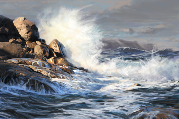
The foreground water, the semi-submerged rock in the lower-right corner and the distant headland and clouds are painted digitally. I've also added some water running off the main rock area because my waves are much bigger than those in the photo reference. The main addition here, however, is that strip of sheet foam that snakes gently up from the bottom of the picture to the focal point. This was designed, quite purposefully, to lead the viewer in. I spent quite a lot of time on that one feature.
I warmed the rocks up a little to boost the contrast between them and the overall cool blue colour scheme. Here's the tonal map of the image at the end of the digital design process.

This has given me a pretty good scene to work with. With the extra foreground, the dark masses now take up most of the area followed by mid tones then highlights. The strongest contrast is still where the big splash meets the rocks.
The next step is to turn this digital composite into an oil painting.
I'll post part four soon.
Seascape oil painting series:
Genesis of a seascape in oil - I
Genesis of a seascape in oil - II
Genesis of a seascape in oil - III
Evolution of a seascape in oil - IV
Evolution of a seascape in oil - V
Evolution of a seascape in oil - VI
No comments:
Post a Comment