I parked at the top lookout on the eastern side of the main beach. The lookout is about 50m above the sea and offers views across the main bay and to the rocky point below.
I watched the waves for a while, not entirely convinced I was going to get a painting out of it. But then I focussed on one large rock below the lookout and, although it was a reasonable distance away, I thought it was worth a shot at painting.
Here's the scene as the camera saw it at 50mm zoom, which approximates our normal field of view. I'm about 50m up and the clear blue water is about 60m from the cliff I'm standing on - so, according to Pythagoras, that vertical boulder to the right of centre is about 78m away from me.
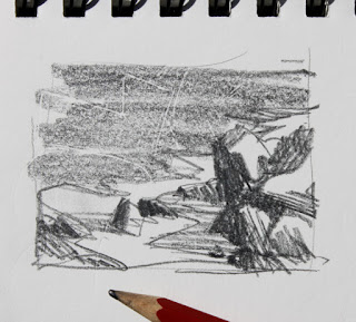
As you can see, there's a lot going on with all those rocks so my first major decision was to choose the boundaries for the painting. I rarely do thumbnail sketches – I should do them, but I don't – but this time I thought it would be wise to plan ahead a little. I chose to focus on the vertical boulder and small area of white water in the centre of the view (the blunt HB pencil in the photo below is for illustrative purposes only, if you'll pardon the pun. It's not the pencil I used but gives you an idea of scale).
The thumbnail sketch suggested that I should pay attention to the strong contrast between the foamy white water and the adjacent rocks and clear water. I could use the whitewater to draw the eye in to the main rock. I made the decision at this point to alter the relative size of the rocks near the middle and to the left so that they didn't all end up the same size. I also decided that I should keep the two central rocks grouped as a single unit. I was also captivated by the lengthening shadows cast on the white water by the rocks and decided these would help to hold all the rocks together giving me a large interesting dark shape rather than a scattered collection of bits.
That's quite a few decisions from a one-minute sketch - and it's more decisions than I usually make before starting to paint. I really should do thumbnails more often, I'd probably waste a lot less paint!
I began by washing in the major darks on a white-primed panel. I wiped back a couple of highlight areas in the rocks and there's a hint of swell out in the open water.
Next I laid in the the white water using a purple-blue for the shaded parts and a warmer green-blue for where the sun would be hitting. It was important to lock this down fairly early as it wouldn't be long before all the foreground white water would be in shadow. You'll notice I dragged the foam over the clear water to create an interesting transition zone. I was feeling pretty positive at this stage.
Here's the obligatory location shot of the painting as it was when I packed up. It was getting dark by now and although the sunset was beautiful, there's no sunlight shining on the rocks below any more.
Below is the finished painting in daylight. I barely touched it in the studio so it's about 99.9% as it was on site. If you squint, you'll see how the shadow area on the white water becomes part of the dark tone of the rock mass. It can be tough to get that tone right because we tend to perceive even the shadow areas of white foam as very light. Squinting at the scene is the key to getting it right.
(Lowlands rocks. Plein air sketch. 30x25cm oil on board. © Andy Dolphin)
I will probably lop a couple of centimetres off the top of this painting as there's nothing of interest up there, plus the image is split almost 50/50 diagonally and the tall rock feels too low in the frame. I knew all this early on (my thumbnail is a better shape) but that's the board I had with me so I just went with it. If I chop it, I'll end up with something like this.
(Lowlands rocks, edited. © Andy Dolphin)
Much nicer proportions, I think.
Of course, sawing a piece off a panel is pretty trivial (unless the saw slips but let's not go there). Real problems arise, however, if you finish a painting then realise you need to make the panel bigger – so try to avoid that eh?


No comments:
Post a Comment