Monday, December 27, 2010

Clear evening sky

Christmas eve was warm and incredibly humid around here. In nearby Albany, the moisture hung like a veil of smoke over the city through to the early afternoon. I've never seen anything quite like it before.

Since the evening sky was looking clear, I headed back to the scene I painted a few days ago when it was overcast.

australian landscape painting
(After Harvest 2. 20x24cm oil on board. © Andy Dolphin)
SOLD

Although I stood in virtually the same spot to do this second painting, I decided to zoom in a little more on the tree. Overall this painting is much warmer but there's still not much detail in the mountains due to the haze. On a clear day you can usually see trees and rocks up there!

As I was painting, I could see the colour changing. The blue was leaving the sky and the mountains as the haze became warmer and heavier. Even the feature tree started to lose its colour and contrast. When I was happy to call the first painting finished, I grabbed another board and captured a quick impression of the same scene before last light.

australian plein air landscape painting at sunset
(After Harvest 3. 20x24cm oil on board. © Andy Dolphin)

This one was fast - about 15 minutes in total. It's turned out just a little bit grey as I didn't have time to clean my brushes or palette but the general feeling is there.

I might have to keep heading back to this spot in different weather conditions and different times of day.

Hope you had a great Christmas.

Thursday, December 23, 2010

Artist Tips #2: Painting from photos

Photos seem like an easy starting point for landscape painting and the advent of consumer digital cameras has made photography more accessible than it's ever been before.

Photographs serve as convenient reference material that allows us to paint when we simply can't - or don't want to - get outside. They are also a handy way to produce a lot of paintings from a trip away.

But photography is not without its problems.

We have a much greater range of tone and colour perception than film or digital cameras do and when we view a landscape, our eyes are constantly adjusting to account for light and dark areas. As a result, photos can rarely match what we see in real life.

To understand one of the biggest problems of relying on photos as a basis for painting, take a look at these two photos...


This scene was quite dramatic to look at but neither photo captures it as I saw it.

When I took the photo on the left, I exposed it for the sky. This makes all the dark areas in the land mass much darker than I perceived them. The photo on the right was exposed by first pointing the camera toward the tree line then pressing the shutter button half-way before recomposing and taking the photo. This opens up the aperture (or the digital equivalent) and gives me detail in the darker areas but blows out the bright areas in the sky. It's almost impossible (for me anyway) to successfully expose both areas in one photo to appear the same way we perceive it with our eyes.

Knowing this happens, I often take several photos, exposing each one differently so I'll have reference material for all areas if I decide to paint from photos.

Although it lacks some of the luminosity I experienced, the left-hand photo does a pretty good job with the clouds and sky colours. The right-hand photo captures some of the depth and detail in the land and tree masses but the sky would be virtually useless as a painting reference unless you have a great memory or are happy to invent colours to give it some life. A lot of photos like these probably never get turned into paintings and we might find ourselves wondering why we even took them (I've got boxes full of such photos from the days of film).

If I painted this scene en plein air, the finished painting would combine elements of both photos and would also likely include more warm-cool contrasts and aerial perspective. Getting the same result from "average" photos takes experience, guesswork, luck or imagination.

If you have access to photo editing software and know what you're doing, it's possible to adjust some "average" photos to more-closely match the scene as you saw it with your eyes.


This is the left-hand photo from above but I've used a curve in Photoshop to pull some weight out of the darkest areas whilst leaving the light and mid tones virtually unchanged. Then I adjusted the saturation a little to push a bit more life into the colours, especially the warm highlights in the sky. It still falls short of the scene as I remember it, but it could form the basis of a painting.

If you love doing representational art - where the things you paint are actually recognisable - then the next time someone says "why don't you just take a photo instead?", you can explain how a painting is so much more personal and how a good painting is vastly superior to the average photo. In the meantime, getting out and studying how light truly effects what we see, even taking notes, will make your photo-based paintings more successful.

Humid!

The sun is still playing hide and seek with us but temperatures are on the rise. The last few days have felt like it was going to rain but it just isn't really happening. This, combined with the warmer days, means humidity! I love days like this - it feels like there's a thunder storm around the corner.

On the way home from my day job, I pulled into a rural driveway and did a quick painting of the sky before sunset.


The tones need a little adjusting but there's potential to turn this one into a larger painting.

After packing up, I encountered this sky a little closer to home...


Rest assured the photo doesn't do it justice. There were different clouds shapes and colours in every direction and the heat and humidity were still electrifying. Just my kind of evening.

PS. I just checked the weather forecast and the Bureau agree there could be thunderstorms.

Sunday, December 19, 2010

Clouds!

I looked outside at 6am and the place was glowing, with strong sunlight streaming through the trees. So I got up, had breakfast and coffee and prepared to go painting. By 7am I was in the van but the sun was nowhere to be seen.

I decided to go out anyway in the hope the clouds would break up as the sun rose higher. I headed out to the Porongurups and the cloud cover got heavier until, eventually, it started to rain.

I pressed on regardless and the sun kept teasing me with hints that it might break though anytime soon.

I drove around Porongurup for a while before noticing a setting that looked like it had been designed by a landscape artist. The tree was the "perfect" shape (a lot of gum trees are a bit on the ugly side) and the backdrop, with a cloud draped over one of the Porongurup Range peaks, was magical. The long dry grass in front of the dark silhouette of the tree sealed the deal for me.

Everything was still basically shades of grey but the cool dark tones of the mountains and trees contrasted nicely with the warm straw stubble in the paddocks.

I decided I'd have to paint it - sunlight or no sunlight.

plein air australian landscape painting
 (Almost finished)

The lack of harsh light meant that I was able to take a little more time painting as the colours barely changed the whole time I was there.

The muted colour also meant I could use a limited palette - Ultramarine, Crimson, Yellow Ochre and Australian Red Gold plus white. I could even have got away without the Oz-Red-Gold but I quite like using it in mixes.

I can't recall the last time I did a landscape without using any cadmium colours - this might be a first!


australian landscape oil painting framed
(After Harvest. 20x24cm oil on board. © Andy Dolphin)

I'm really pleased with this one and I think I might do a larger painting from it.

Saturday, December 18, 2010

Latest paintings

Here's the Porongurup landscape painting I did a couple of days ago. I've popped it in a frame for you.

plein air porongurup landscape painting
(Knights Road, Porongurup. 20x24cm oil on board. © Andy Dolphin)

Here's another one of the Porongurups that I did about four days earlier.

plein air porongurup landscape painting
(Woodlands Road, Porongurup. 20x24cm oil on board. © Andy Dolphin)

The top painting was done using a chisel-edged synthetic brush while the bottom painting was done with bristle brushes. Click on them both to compare the different finishes.

Both paintings were done en plein air but I must confess to making a few adjustments to the bottom one in the studio ans the light was fading fast when I painted it.

Thursday, December 16, 2010

Another sunny day - sort of...

There were fluffy clouds around all day today but it was warm and sunny for the most part, making it the second sunny day so far this summer.

I headed out to the Porongurups this evening and found a pleasant spot off the side of Knights Road, looking south toward the mountains. The cloud cover had increased and there were a lot of cloud shadows, especially on the distant hills, but the foreground was bathed in sunlight.

I set up and started painting, taking careful note of the major shadows cast by the foreground and mid-ground trees. This was to prove prophetic as the clouds soon rolled in and before long, nothing was in sunlight. I continued painting with an image firmly in my mind. It was quite pleasant as things don't change much when it's cloudy - but I needed to be careful to not go painting too much detail in the shadow side of my main tree (shadow areas become more detailed in the absence of bright, direct light).

Eventually the sun peeked through for a few minutes and I took this opportunity to put highlights on the main trees and some of the sunlit grass.

plein air porongurup landscape painting western australia

After I took the photo, I made a few more additions and adjustments, including reworking the clouds which looked too heavy and somewhat dull.

I stayed fairly true to the scene before me. The only "major" change I made was to turn the two foreground trees into just one as they were almost in line from where I stood to paint. I also made the mountains slightly taller so they didn't "kiss" the top of the that tree. Compositionally, it's best to have edges either overlapping or not touching at all rather than just touching.

I used just one square, synthetic brush on almost the entire painting. It's a brush I've owned for years but I think this is the first time I've used it - I usually use square or filbert bristle brushes. The synthetic brush is more pliable and cleans much more easily than the bristle brushes. I think I'll be using it again for my plein air work.

A sunny day at last!

The first 11 days of summer were, to say the least, somewhat heavily overcast around these parts. I ventured out once or twice to see if anything paintable grabbed my attention but I really am driven by sunlight and shadows so never got my brushes wet.

Finally, on day 12, the sun shone with a vengeance. With a huge blue sky and the temperature hitting the low thirties (Celsius), painting was back on the menu.

For weeks I've driven past a WA Christmas Tree on the side of Albany Highway and kept telling myself that when the sun came out, I was going to paint it. It was frustrating seeing it every day under grey skies. They're still spectacular with their near-fluorescent yellow-orange flowers but I wanted shadows. I took a few photos when the clouds were a little thinner but they were less than inspiring.

When the sun finally did make an appearance, I headed straight to this tree.

Albany Highway carries some large trucks and plenty of traffic, all doing 100kmh-plus, so I didn't really want to stand my easel on the edge of the road. Instead, I parked my van in a driveway across the road from the Christmas tree and set my easel up in the passenger seat. I painted for half an hour - and it was the most-uncomfortable half hour I've suffered for a while! But at least I got my painting.

plein air oil painting wa christmas tree - nuytsia floribunda
(Nuytsia by Highway. 20x24cm oil on board. © Andy Dolphin)

It's only a quick sketch really but I'm happy with what I've captured. My main interest was the contrast between the ultra-warm sunlit flowers and the cool-dark greens of the shadow side of the foliage mass.

I'd previously given this panel a red tone that you can see peeking through all over the painting. I used a limited palette of five colours to help speed things up a little.

A herd of cattle wandered into the scene when I was half-way through painting. They hung around for a long time and it took a lot of effort not to add them in.

The Christmas trees are putting on a good show this year and I hope to capture a few more in paint before the flowering season ends.

Saturday, December 11, 2010

Gallery run

My wife and I did an 800km round trip today to deliver the following paintings to two wonderful galleries...

BORANUP GALLERY, Margaret River, WA

(Forest Road. 33x46cm oil on board. © Andy Dolphin)
SOLD

(Survival. 54x30cm approx - oil on board. ©Andy Dolphin)

(Shoreline. 54x30cm approx - oil on board. © Andy Dolphin)

 (Herefords. 25x35cm oil on panel © 2010, Andy Dolphin)

shed landscape in oil andy dolphin
(Shed in Summer Light. 70x37cm oil on panel. © 2010, Andy Dolphin)
SOLD

 (Twilight in the Bay. 70x37cm oil on panel © 2010, Andy Dolphin)


GOLD 'N GRAPE GALLERY, Pemberton, WA

porongurup, australian landscape, oil, andy dolphin
(Summer's Eve, Porongurup, 2010. Oil on board, 70 x 37cm. © Andy Dolphin)


(Nuytsia floribunda. 25x35cm oil on panel © 2010, Andy Dolphin)

(Stirling Evening, 40x60cm oil on panel. © 2010, Andy Dolphin) 
SOLD


If you find yourself in the south west of WA, take the time to visit these galleries. They have much to offer and you could easily spend an hour or more just browsing each one.

*Note: Due to the variability of browsers and monitors and the vagaries of photography, colours are not guaranteed to match what you see on screen but I have adjusted to be as true as I can make them.

Saturday, November 27, 2010

Plein air time again!

It's been a while since I managed to get out and do a plein air painting - I tried last week but it wasn't to be. I threw my gear in the van and set off about town, looking for something "easy" to do, to get myself back into the swing of things. It was a hot humid day with thunderstorms a distinct possibility. As it happened, the thunderstorms never came but the clouds did.

I found some interesting spots but without sunlight they just didn't grab me enough to justify getting my brushes dirty. So home I went.

Today, however, was warm and sunny - windy too but with clear skies as far as you could see. So off I went in search of something new. I think I found it, on a back road/track, just north of Narrikup.

This mostly-gravel road has a few interesting sandy sections that give the landscape a very different feeling, somewhat like "warm snow". The shadows have a purply-grey coolness about them with stark warm highlights in areas where the sun breaks through. I enjoy painting sandy tracks more than gravel ones. They "feel" more natural somehow.

This section of track featured a WA Christmas Tree (Nuytsia floribunda) which stood out like a beacon against the other trees and scrub. It begged me to paint it.

wa christmas tree plein air oil painting

It's early in the flowering season yet for Nuytsias, but this one was a little ahead of most in the region. I'll have to remember to take another look in a couple of weeks as there are still a lot of unopened flowers on it.

 (No, I didn't stand in the middle of the road while painting.)

I had to work fast on this one as I could see the light was going to change dramatically. Not only did the track fall almost entirely into shadow, as you can see above, but the sunlight warmed considerably, giving the green-grey shrubbery a warm orange glow.

Plein air painting... you don't have to be mad, but it helps.

Tuesday, November 16, 2010

Alf Stewart digital sketch

I started this one a couple of months ago. With a feature-loaded face, I thought Australian actor Ray Meagher would be an easy person to caricature but I found him incredibly difficult and my efforts either looked grotesque or like portraits.

So here's a not-so-caricatured-portrait sketch of "Alf Stewart" from Home & Away.

alf stewart Ray Meagher sketch
 ("Alf Stewart" - digital sketch. Original 1000x1300px . © 2010, Andy Dolphin)

Any caricaturists reading this - have a go at Alf and let me know in a comment how you fare.

Created with a Wacom Graphire 4 tablet and Photoshop CS.

Thursday, November 11, 2010

Gerard Henderson digital caricature update

Still working on this. I have to be careful not to adjust things so much that it ends up looking like a portrait instead of a caricature. I think I'm near enough that I can start adding some colour...

(Gerard Henderson - digital sketch. 1000x1000px . © 2010, Andy Dolphin)

...and here he is with a bit more adjusting and some basic shading.

(Gerard Henderson - digital sketch. 1000x1000px . © 2010, Andy Dolphin)

See the earlier stages at - Gerard Henderson digital caricature

Wednesday, November 10, 2010

Gerard Henderson Digital Caricature

I caught The Insiders on ABC TV on Sunday morning and got the urge to have a go at doing a caricature from the screen. I grabbed a biro and scrap of paper and began doodling quick sketches of Brian Toohey and Gerard Henderson. The efforts weren't great (time was short) but gave me the urge to try and do a finished caricature of Henderson.

I was struck by his pouty expression which deserted him only momentarily during the broadcast.

Online photos of him are rare but I'm going to see how I go. Here's an initial sketch (about ten minutes work) based on a combination of photo reference and my Sunday morning sketch. It looks a little like Rupert Murdoch at this stage.

(Gerard Henderson - digital sketch. 1000x1000px . © 2010, Andy Dolphin)

Here's a follow-up sketch. About another 20 minutes work here and it's starting to look a little less Murdoch and a little more Henderson.

gerard henderson caricature
(Gerard Henderson - digital sketch. 1000x1000px . © 2010, Andy Dolphin)

Thursday, October 14, 2010

Artist Tips #1: Media

In my lifetime, I have painted with darned near everything meant to be used as paint. I've used automotive lacquer, industrial enamel, vinyl paint, fabric ink, dye, water colour, gouache, pastel, acrylic and oil - and probably a few I've forgotten about.

These days I paint exclusively in oils but they do have the issue of the foul aroma and messy clean up with turpentine so it's understandable why a lot of people don't begin their art journey with oil paint.

A lot of beginners do seem to start out with water colour and I've never really understood why. Other than the ease of cleaning up, since water colour remains water-soluble so will always wash out of brushes, I'm not certain why it enjoys such mass appeal to people starting out. Water colour washes are transparent so once a mistake occurs, it's virtually impossible to fix as it continues to show through subsequent layers. Even after decades of using all manner of media, I shy away from water colour as it requires an organised approach for the best results. It actually adds a level of difficulty that beginners don't need.

Gouache is basically water colour with chalk added. It shares the benefit of easy-clean-up but because it is far more opaque, it is somewhat more forgiving than water colour. However, because it always remains water soluble, heavy handed attempts to re-work existing layers of paint can soon lead to "mud". Still, I'm tempted to give gouache a serious go one of these days.

In my opinion, acrylic paints are among the best media for beginners. There is a range of opaque and translucent colours and they wash up with water but dry waterproof. There is a huge range of additives which will extend the qualities of acrylic paints. There are thickeners that allow for heavy impasto work, reducers that add water-colour-like qualities, retarders to slow the drying time, crackle mediums to make instant "ancient" paintings and more.

So when I first started in fine art, acrylic was my medium of choice. I'd used hundreds of litres of the stuff as a muralist and signwriter so I had a firm grip on its strengths and weaknesses, including the fact that a lot of colours will dry significantly darker than you might expect.

Acrylic paints certainly aren't without their problems and the worst one will bite every acrylic painter one day. The fast drying time, combined with acrylic's waterproof quality, means that your brushes are in constant peril. If you put a brush down with paint on it - and forget about it - then that brush might well be destined for the bin. There are cleaning products that will help recover such a brush (methylated spirits will do it if you catch the problem early enough) but it will never be the same.

IMPORTANT: Sable brushes and acrylic paint should never share the same space unless you're meticulously organised, or rich. I'd recommend some of the vast range of synthetic brushes for most acrylic work.

In my experience brushes have to be regularly flushed in a large jar of water while painting and thoroughly cleaned with soapy cold water (not warm or hot) when finished.

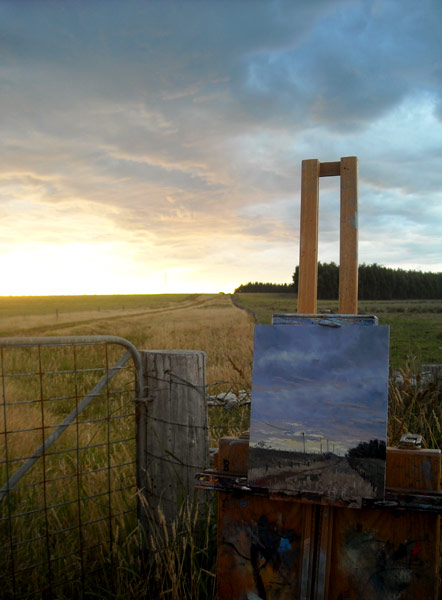
For the plein air (outdoor) artist, acrylics pose another problem. Any slight breeze, especially on a warm day, will constantly dry the paint on the palette. It's a genuine frustration on the worst days as it starts to feel like you're painting with clay, or sand.

To get around this problem, I made myself a non-drying palette. This is very simple and worked better than I'd anticipated.


I used a clear plastic kitchen container about 25-30cm square and 5-7cm deep. I cut a chamois-like dish cloth (the soft, slightly-furry kind) to fit the bottom of the tray and a sheet of grease-proof (baking) paper to sit on top of this.

I carried water in a large bottle and added a little to the tray before starting to paint. The trick is to get the cloth just wet enough that no water is slopping around. Then I'd set out my colours on the baking paper. The sides of the container help to reduce the effects of a light breeze and the wet cloth keeps the paper palette cool and moist. If things got too messy, I'd tear off a new sheet of paper (I carried a small roll with me) and lay it over the top and keep painting. On very hot days, a spray bottle is a handy addition to help prevent the whole thing drying out. 

When I was finished, I'd pop the lid on the container and the paint would still be useable when I got home. The paper palette is disposed of and the cloth rinsed out and dried for next time.

IMPORTANT: Don't leave the wet cloth stored in the sealed container. I learned that rule the hard way - it isn't pretty!

I used jar colours, rather than tube colours because, at the time, they represented much better value. The problem is that it's easy for things to get messy if you work directly from the jars. One day you're going to dip the blue brush into the yellow jar then kick yourself silly. Also, every time you open the jar, you expose the paint to fresh air and I've found that the paint can thicken over time and there is always an annoying buildup of dried paint on the jar thread - and it seems to like jumping into the jar at every oppoortunity.

To solve this problem, I purchased a couple of dozen small squeeze bottles. I scooped colours into separate bottles with popsticks then resealed the jars. I even made some pre-mixed colours which was often a great time saver. Old film canisters offer an alternative (if you can find them these days). They weren't quite as handy as the squeeze bottles but were excellent if I wanted to use large washes as I could add a retarder medium and water to the container and use them almost like ink.


I haven't used these bottles for years but many still have perfectly useable paint in them. Of course, if you're using tubes, a lot of these problems are already solved for you. My only suggestion there would be to squeeze the tube before putting the lid back on to minimise the amount of air inside.

In my early days, I painted exclusively on quality canvas boards. They made life easy. These days it seems like every second shop is selling either canvas boards or stretched canvases for next to nothing. It would be hard to beat them for learning with.

So there's my thoughts on acrylic paint, the perfect beginner's medium - well, it was until they invented water-mixable oils... :)

Wednesday, October 13, 2010

Ellis House Community Art Centre

The year was 1999 and at a tender 38 years of age, I joined the Bayswater Art Society. Since the early '80s, I'd worked as an airbrush artist decorating custom painted vehicles, an illustrative signwriter painting massive murals on city buildings and billboards and later, through to the late '90s, as a graphic artist and illustrator. In all that time I never really tried my hand at painting for painting's sake, it was always a commercial enterprise where the client dictated the subject.

I still recall the night I went along to my first art society meeting. I sat outside in my car, watching people arrive as I tried to decide if this was for me (I don't like change, and this was something new). Eventually I convinced myself I had to see what it was about and I ventured inside. I was warmly welcomed by the members and thoroughly enjoyed the night, which included a demonstration by a practising artist.

I also met Derna Johnson, a wonderful artist especially renowned for her paintings of fairy wrens and poppies and a pocket rocket of a lady who soon took me under her wing and guided me through the Western Australian art scene. In my early fine art days, she would critique my paintings for me and it was always valuable advice. As I began to develop my own style, Derna steered me toward worthwhile exhibitions and galleries. She also introduced me to the WA Society of Arts where I met more amazing artists. Before I knew it, I was being invited to stand in front of the membership of both societies and demonstrate my skills! I hadn't envisaged any of this just a few years earlier when I tossed up if fine art was for me or not.

I owe a huge part of my subsequent art success to Derna's inspiration, encouragement and guidance.

When I left Perth in 2003, Derna had just taken on a project for the City of Bayswater to turn historic Ellis House into an art centre. I doubt anyone at the council could have foreseen what lay in store but they were in for a treat. Derna is visionary and doesn't do things by halves.

Built in the early 1900's, Ellis House is located near the Swan River at 116 Milne Street, Bayswater. It was the first dairy farm in the Bayswater district but by the mid 1990’s it had  fallen to neglect and vandalism. In 1995 it was refurbished by the City of Bayswater and later they publicly invited ideas for future use.

My wife Janet and I dropped in to see Derna and a few of my old art friends during a trip to Perth a few months ago and it was clear that she and her band of volunteers have created an icon, a paradise. Ellis House today is a thriving art centre with ongoing exhibitions and a growing membership of artists and friends. It is an eastern suburbs hub for artists and art lovers and just a delightful place to spend time. If you're in the area, or have the time to get there, go and take a look, you'll be glad you did.


 (Photos courtesy of Ellis House)

Earlier this week I received a couple of emails from Derna and discovered that she's been undergoing chemotherapy. My heart sank but in typical Derna style, this was an enthusiastic message of her good health and projects she's taken on to help other cancer sufferers. Derna always knows how to make lemonade out of lemons.

I called and asked her if she could have a chat with her doctor and get him to extract just a little of her drive and enthusiasm, then bottle it and market it. I want to be first in line.

One of Derna's projects is a list of tips for chemo patients, drawn from her own experiences of learning the hard way. I've asked her if I can share it with my readers and hope to put it here soon, once she's ready for it to go public. I don't think she'll mind if I share the first and possibly most important tip with you now though:

"Trust your doctor and his medical team, they know far more than we do, a whole lot more!"

Thanks Derna. Look forward to seeing you again soon!

Thursday, August 26, 2010

Knockout caricature

When I'm not painting or blogging, I am the production manager at the Albany & Great Southern Weekender newspaper. Today, one of my caricatures adorned the front page.

(Tuckey vs Crook. Digital. Original image 25x25cm @300dpi . © 2010, Andy Dolphin)
 
Wilson Tuckey had been the political representative for the federal seat of O'Connor for thirty years. It was considered one of the safest seats in Australia until boundary changes were made prior to last week's election. As a result of those changes, The Nationals' Tony Crook became a legitimate contender for the seat. Following a notable pre-election battle, Crook eventually won the seat after preferences were distributed.

As with my other caricatures, this one was done in Photoshop CS using a Wacom Graphire4 tablet & stylus. With relatively short notice, and with Mr Crook not previously being a well-known face, I'm really pleased with the way this one turned out.

Friday, August 20, 2010

Nuytsia floribunda: Oil painting

My most recent oil painting.

 (Nuytsia floribunda. 25x35cm oil on panel © 2010, Andy Dolphin)

This was based on a digital painting I did a few weeks ago.

Everyone's an art critic!

Dirty Harry, a saltwater crocodile at Crocosaurus Cove in Darwin, was shown my recent caricatures of Julia Gillard and Tony Abbott.

It's hard to read a crocodile's mind so I don't know if snapping at Julia was a tick of approval for my digital painting technique - or a scathing critique.

Perhaps he found the complementary juxtaposition of the flaming red hair and neutralised green background just a little too contrived.


Okay, so it wasn't really an art competition. The real story is that Harry was asked to predict the outcome of this weekend's federal election, using two of my caricatures and some chicken carcasses.

It seems he took a liking to Julia's carcass.

The ABC has video here.

Sunday, August 8, 2010

Blog Frog: Digital painting

Another digital painting. This little guy (or girl?) is one of up to 30 green tree frogs that live in our backyard pond. They are so comfortable there that you can get within 30cm of them to take photos.

green tree frog digital painting

 (Tree frog - digital painting. Original 1450 x 1000px . © 2010, Andy Dolphin)

Thursday, August 5, 2010

Millie: Digital painting

Another digital sketch. This time it's one of our four pet lambs, Millie.

 (Millie - digital painting. Original 1200 x 1050px . © 2010, Andy Dolphin)

Thursday, July 29, 2010

Nuytsia: Digital painting

Caricatures are great for exercising observation and hand-eye coordination but I only do them for fun. My real love is the Australian landscape.

Tonight I was flipping through some old photos and found one of a WA Christmas Tree (Nuytsia floribunda). It was essentially and abstract rush of bright oranges against near-neutral blues and greens. I had to do something with it.

Here's the result of about an hour and a half's painting in Photoshop.

nuytsia floribunda Christmas tree painting
 (Nuytsia - digital painting. Original 1800 x 1200px . © 2010, Andy Dolphin)

I think I need to try it in oils now.

Monday, July 26, 2010

Tony Abbott: Digital caricature

Following on from my Julia Gillard caricature, and with the federal election now in full swing, I thought I'd better post an updated Tony Abbott caricature.

politics tony abbott caricature
(Tony Abbott - digital. Original 1200 x 1200px . © 2010, Andy Dolphin)

See my first Tony Abbott caricature

Thursday, July 22, 2010

Twilight in the Bay: Oil

Here's one I did a couple of weeks ago.

 (Twilight in the Bay. 70x37cm oil on panel © 2010, Andy Dolphin)

You can get a little background on this painting in the following articles:

Perfect plein air afternoon
Preliminary sketch

Army Art 2010

Army Art is an annual charity art exhibition featuring the original works of invited artists from around WA.

This year's exhibition will be held at Leeuwin Barracks, Riverside Road, East Fremantle on Saturday and Sunday, 15th & 16th of August. All exhibited work will be for sale and part proceeds will benefit the Recreation & Sport Network.

I will have several pieces there and am looking forward to catching up with lots of artist friends I haven't seen since leaving Perth over six years ago.

Monday, July 19, 2010

Herefords: Oil painting

Along with all the digital fun I've been having, I have been doing a little oil painting lately.

Here's the step-by-step process of my latest painting based on a digital painting I did a couple of weeks ago...

 (Herefords- digital painting. 700x500px . © 2010, Andy Dolphin)

This is the digital painting that served as a starting point. Since the computer is nowhere near my painting room, I used an earlier oil painting as a reference whilst painting and only occasionally looked back at the digital picture to see if I was heading in the right direction.


A quick layout of the major shapes and undertones (shadow tones). The paint was thinned a little with turps and whisked on with a pastry brush.


Starting with the sky and working down the painting and from background to foreground, I begin working over the painting with thicker paint. I'm still focussing mainly on shadow tones though I've added a subtle highlight to the distant hills.


After all the major shadow tones have been reworked, I apply heavier layers of local colours.

 (Herefords. 25x35cm oil on panel © 2010, Andy Dolphin)

Once I had the bulk of the painting "feeling" about right, I scraped out the areas where the cattle had to go using a small, dry filbert brush. Then the beasts were added using the same process - undertone, midtone, highlight. Once they were in place, I worked back over other areas, softening some detail and adjusting colours until I declared it finished.

In many ways the finished painting is quite conceptual compared to the near-literal interpretations of scenes that I usually paint. The primary focus throughout was to keep the majority of colours controlled in such a way that the "red" herefords almost glow in the evening sunlight.

Note: The photography on some of these is a bit sad. Sorry.

Sunday, July 18, 2010

Julia Gillard: Digital caricature

Looking around the web I found very few caricatures of our new Prime Minister, Julia Gillard. Those I did find focussed very heavily, and unsurprisingly, on her red hair and somewhat prominent proboscis.

For several weeks I've been attempting to capture her in a caricature without going for the obvious profile shot with the exaggerated nose as the focal point. Despite what this news story might imply, there's more to Ms Gillard than her nose.

Here's my latest attempt...

julia gillard caricature
 (Julia Gillard - digital. Original 1200x1350px . © 2010, Andy Dolphin)

Here's a slightly revised version. Play 'spot the difference' if you like...

 (Julia Gillard 2 - digital. Original 1200x1350px . © 2010, Andy Dolphin)


Friday, July 16, 2010

Bones: Digital caricature

Following from my previous sketch and mono caricatures of Emily Deschanel and David Boreanaz (Bones & Booth), I spent this evening adding colour to my "Bones" caricature.

emily deschanel bones caricature
 (Emily "Bones" Deschanel - digital. 800x880px . © 2010, Andy Dolphin)

For this caricature, I added colour over the previous greyscale image. I thought this might be faster than colouring from scratch but now I'm not so sure. I spent a lot of time fighting the "dirtiness" of the grey. Next time I have a greyscale image, I think I'll only use it as a reference.

Image made completely in Photoshop CS using a Wacom Graphire4 (4x5") tablet.

Wednesday, July 14, 2010

Bones & Booth: Digital caricature

I did a caricature of David Boreanaz (Agent Booth) a few nights ago and one of Emily Deschanel (Temperance "Bones" Brennan) last night. Here they are as a "couple".

The styles differ very slightly as I'm still coming to terms with both caricaturing and digital painting but I think they're recognisable.

bones & booth caricature
 (Bones & Booth - digital sketch. 900x850px . © 2010, Andy Dolphin)

Monday, July 12, 2010

Sketching Bones

Once again it's time for something different.

This time it's a quick digital sketch of Emily Deschanel, better known as "Bones".

emily deschanel bones sketch
 (Deschanel "Bones" - digital sketch. 1000x1000px . © 2010, Andy Dolphin)