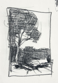
This isn't something I have done a lot of in the past but lately I've been driven to discover why some paintings end up on "the pile in the corner", instead of hanging in a frame. So I've been looking through that pile to see where I can spot obvious design errors as, in many cases, this is where a painting fails.
One of the pieces I looked at this week was a painting of Lights Beach I did in March last year.
(Breaker at Lights Beach - sketch. 30x20cm oil on board. © Andy Dolphin)
This painting was done as an exercise, from photographic references, and I have messed with it several times in the last 10 months, playing with shapes and contrasts to see if I could get more out of it. My main interest early on was the depiction of the foam trails breaking up as the transparent water rises into the main wave.
It is fairly true to the photos but I always felt it was a little contradictory as it portrayed a supposedly large threatening wave but was, at the same time, bright and sunny. My biggest issue with it, however, was the relatively horizontal feeling of the design, the detachment of the rocky areas and the lack of a path through the painting to the focal point. There is a path there, through the greenish water to the peak of the wave, but it's very subtle and doesn't act to connect to the foreground to the middle ground.
I've painted quite a few plein air wave studies since last March and I feel I'm in a better position now to incorporate some of that experience into future seascapes.
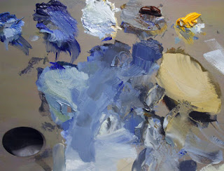
I put the small painting on my easel and gave it a light coating of alkyd medium to wet the surface and bring the painting back to life. With just a few colours on the palette, I spent about half an hour loosely "sculpting" paint over the old painting. Abandoning my earlier focus on the transparent part of the wave, I altered shapes and shadows in an attempt to get a more dynamic composition and more of a feeling of power in the surf.
Here's where it's at now...
(Breaker at Lights Beach - sketch. 30x20cm oil on board. © Andy Dolphin)
It's pretty loose, with some areas almost completely unresolved, but that's okay for this painting. What matters more is that the foreground and middle ground are now decidedly interconnected and that there is a feeling of powerful movement in both the foreground and mid-ground water.
While it is no longer exactly like the original photo reference, it is still true to the location and captures the feeling of the place much better. It feels like it has potential now and I'll visit it again soon in order to tidy a few things up.
The revised painting now becomes stage 5 in my Evolution of a seascape in oil series.
Seascape oil painting series:
Genesis of a seascape in oil - I
Genesis of a seascape in oil - II
Genesis of a seascape in oil - III
Evolution of a seascape in oil - IV
Evolution of a seascape in oil - V
Evolution of a seascape in oil - VI


