
Before I left Perth to move to the country, around 14 years ago, I bought some watercolours, brushes and a pad of watercolour paper , with the expectation that I might start doing some plein air watercolour paintings.
It never happened.
Since buying them, the paint tubes have remained unopened.
I recently discovered the Youtube channel of British watercolour artist Tim Wilmot, where he methodically demonstrates his approach to loose, semi-abstracted representational painting. It's a style of watercolour I have always liked and his demonstrations make it look possible.
So, with my new-found enthusiasm for watercolour, I dug out an old plein air oil painting - which has it fair share of issues - and decided to repaint it in watercolour while fixing some of those issues along the way.
In the hope it wouldn't be complete disaster, I also decided to video my progress. And since it wasn't a complete disaster, I edited the video and uploaded it to Youtube.
I hope, soon, to do an updated studio oil version of the original plein air painting. It will be interesting to compare the results.
Showing posts with label step-by-step. Show all posts
Showing posts with label step-by-step. Show all posts
Friday, September 1, 2017
Monday, August 14, 2017
How to make artists' drawing charcoal
I was bored one wet, cold, miserable winter's day, do I decided to have a go at making my own drawing charcoal.
We are lucky enough to have a wide range of trees on our property, including a variety of fruit trees, so I was spoilt for choice of what wood to use.
Willow is often recommended as suitable for making drawing charcoal, but we don't have any willow.
Grape vine is a popular choice and I have also heard of apple being used successfully. We have both of those available.
I snipped a couple bits of semi-hard wood from an apple tree and grape vine then prepared it for roasting into charcoal.
I videoed the whole process, so you can follow along on Youtube.
For those who like a bit of science, I included a brief, simple, infographic explanation of pyrolysis; the process that sees wood turn into charcoal instead of ash.
I did a quick test with the charcoal and thought it performed pretty well, although some bits were a little scratchy. I hope to do a few more experiments using different woods and longer roasting times and see if I can get better results.
Thursday, July 7, 2016
Bob Katter - Digital Caricature

Bob Katter
Original 1200x1400px
Digital Caricature
© Andy Dolphin
Original 1200x1400px
Digital Caricature
© Andy Dolphin
As Australia waits to find out the identity of it's next Prime Minister - the 15th in about six years, I think - one man stands out from the crowd.
Bob "Mad Hatter" Katter.
Famed for owning an Akubra for almost any occasion, Bob ventured out today and threw one of those many hats into the ring to help bring an end to the federal election count, some time before Christmas.
While some in the mainstream media have entertained the idea that Bob could become something of a kingmaker in a hung parliament, I think that after today's chat with the press he's looking more like he wants to be King.
With that in mind, I had to try a caricature of a man who is already a life-size caricature of himself.
I recently polished the drawing surface of my Wacom Intuos Pro (because I found it to be unusable with the nib-eating sandpaper surface Wacom gave it) and it is now a beautiful thing to behold... so I used that to draw the caricature on a 27" iMac and captured the action with Quicktime while I was at it.
You can watch the time-lapse caricature drawing on my Youtube channel.
Friday, November 6, 2015
New video graphics tutorial - Lens Flare
My other blog is currently undergoing redevelopment so I'll post this here for now.
I downloaded Motion 5 a few months ago and one of the first projects I used it for required lens flare effects. Motion 5 only ships with a very simple, two-dimensional flare generator, so I had to find ways to make the desired effect myself.
I muddled through, learning Motion 5 as I went, and ended up with something half-decent, but it was an impractical way to achieve it so I set about finding a better way.
I banged my head against it for a couple of weeks and eventually, after several false but promising starts, I stumbled across Parameter Behaviours and unlocked the secret I'd been searching for.
I just uploaded a video tutorial explaining the building blocks of this method and hope it proves useful for others trying to solve the same problem.
Apple Motion 5 Lens Flare Effect Tutorial
Saturday, July 11, 2015
Announcing my new blog

Floral fireworks
12.5cm x 22.5cm oil on ply panel.
© Andy Dolphin
12.5cm x 22.5cm oil on ply panel.
© Andy Dolphin
I've had a bit of a break from painting but things have been happening - a lot of it has more to do with antique clocks than painting, but things have been happening.
One big change is that my blog now has a new home on my new website, made by my son Michael Dolphin.
If you have this site bookmarked or memorised, you'll need to change your links, or rewire your neurons, and make note of the new address at andydolphin.com.au/blog/
To launch the new site, I have uploaded a new three-part video to Youtube documenting the painting of a small floral still life in oil.
Friday, August 8, 2014
Brass vase and flowers - still life in oil
Here's the latest painting in my "brass on red" series.

As with the other still lifes, I'll probably work a little more on this one after it's dried a bit. I'll also try to get a better photo.
Here's how it looked as just an under-painting.

I liked it so much at this stage, I'm thinking of doing a similar one with orange flowers.
I never intended for this to be a series but I'm enjoying the vivid colours and will probably keep playing with different arrangements until I get bored with them.
NEWDEGATE MACHINERY FIELD DAYS
September 3 and 4, 2014
I entered the Newdegate Machinery Field Days art competition for the first time last year. My wife and I took the 3-plus-hours trip to visit the event and were impressed with the exhibition so I decided I had to enter again.
You'll find Newdegate about 400km south-east of Perth and 50km east of Lake Grace.
If you're anywhere near that region in a few week's time, you really should pay the show a visit. I may even bump into you there.
Brass vase with yellow bouquet
25x30 cm oil on board.
© Andy Dolphin
As with the other still lifes, I'll probably work a little more on this one after it's dried a bit. I'll also try to get a better photo.
Here's how it looked as just an under-painting.
I liked it so much at this stage, I'm thinking of doing a similar one with orange flowers.
I never intended for this to be a series but I'm enjoying the vivid colours and will probably keep playing with different arrangements until I get bored with them.
NEWDEGATE MACHINERY FIELD DAYS
September 3 and 4, 2014
I entered the Newdegate Machinery Field Days art competition for the first time last year. My wife and I took the 3-plus-hours trip to visit the event and were impressed with the exhibition so I decided I had to enter again.
You'll find Newdegate about 400km south-east of Perth and 50km east of Lake Grace.
If you're anywhere near that region in a few week's time, you really should pay the show a visit. I may even bump into you there.
Thursday, March 27, 2014
Chinese vase still life - new video

Miniature Chinese vase
21x25cm oil on board.
© Andy Dolphin
I uploaded a new video last night giving a glimpse of the process I followed when painting my Miniature Chinese Vase still life.
As always, it's best if you go to Youtube to see the video in higher resolution.
Let me know what you think. If I get enough feedback, I'll look at uploading videos more often, so if you like it, share it widely via your favourite social media.
Sunday, September 1, 2013
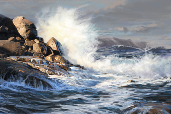
Lowlands Splash - digital painting video
A while ago I promised to upload a digital painting tutorial and today it's finally done.

I recorded this over a month ago but it's taken me a while to do the voice over and editing. Anyway, here it is.
This painting is based on a section taken from a plein air seascape oil painting I did at the start of the year.
NOTE: As I always say, you can watch it here on the blog but I'd recommend going to Youtube and viewing it at full size (480p).
It's a pretty simple sketch and is unlikely to win any digital painting awards anytime soon - but it only took around 45 minutes to throw together one evening. Another hour or so of tightening up and adjustment could turn it into something special.
Thanks must go to Chris Wahl who has made a heap of Photoshop Brushes available for download from his Art Brushes blog.

Lowlands Splash.
Digital painting.
© Andy Dolphin
Digital painting.
© Andy Dolphin
I recorded this over a month ago but it's taken me a while to do the voice over and editing. Anyway, here it is.
This painting is based on a section taken from a plein air seascape oil painting I did at the start of the year.
NOTE: As I always say, you can watch it here on the blog but I'd recommend going to Youtube and viewing it at full size (480p).
It's a pretty simple sketch and is unlikely to win any digital painting awards anytime soon - but it only took around 45 minutes to throw together one evening. Another hour or so of tightening up and adjustment could turn it into something special.
Thanks must go to Chris Wahl who has made a heap of Photoshop Brushes available for download from his Art Brushes blog.
Saturday, August 10, 2013
Cottage - plein air oil painting
I mentioned recently that I've found a new favourite painting spot. It's a farm, less than 10 minutes from home, with a history dating back to the late 1800s.
I've been given permission to do some painting around the property and have spent quite a lot of time out there over the last week and have taken a lot of photos since the weather has been less-than-forgiving and mostly not suited to painting outdoors. So far, I've managed to paint five times, and it's rained on three of those occasions.
On my first visit, I wandered around an old, derelict cottage and was captivated by its sunlit eastern face. I photographed it and studied the photos over the last week. I even did a rough Photoshop sketch of it.
Today we had clear skies again, so I headed out to the farm knowing exactly what I planned to paint. It was time to test my "contemporary impressionism" skills again.
So, without further ado, I bring you "Narpyn Cottage, winter morning"...

At 38x35cm, this is probably the second-biggest plain air painting I've ever done and, at somewhere between 3.5-4 hours to complete, it took the longest, by far. I don't think it's finished yet, though.
Here's stage 1 - the under-painting...

This is a combination of washing-in and wiping-out. Although the idea is to keep things fairly loose, a lot of important questions are asked at this stage. Where are the major darks? What's warm, what's cool? Is it too centred, too high, too low? Why do people say painting is relaxing? Should I have taken up golf instead? The questions just keep coming – the same questions, every time. Some remain unanswered.
There's 15-30 minutes work here.
And here's stage 2, almost two hours in (I didn't know it had taken that long, but that's what my camera claims)...

By this time, the sun had risen pretty high and shifted across to the left, so the shadows had all changed. It was important to try and stick with my layout and not be tempted by what I was seeing in front of me. By the time I finished, the sun had moved far enough that none of these walls were sunlit.
Ordinarily, a thumbnail sketch is a useful reference for dealing with the changing-shadows problem but, in this case, I'd had the image stuck in my head for a week, so I didn't do a thumbnail.
I used the palette knife quite a bit in this painting - for adding and removing paint. That's a whole new world for me. Until this week, I've usually only used a palette knife for mixing paint or, more often, cleaning my brushes - or, sometimes, deleting sections of paintings, or deleting entire paintings. I still have to tame the knife, but this property will offer me a lot of opportunities.
I was exhausted, mentally, when I got home. So I had some lunch and a nanna nap. Then I got up, had coffee and went back for more before sunset. I didn't have much time so I almost literally threw this one together...

There's just less than an hour's work here, and much of that time was spent on the two sheds. Actually, most of it was probably spent on the white shearing shed. So many shades of "white"!
When I put the brushes down, the sun had set and the entire scene was in shadow. But when I turned around, the sky was a brilliant orange-violet. Five minutes later, it was all gone.
It was great to have a day with mostly-clear skies.
I've been given permission to do some painting around the property and have spent quite a lot of time out there over the last week and have taken a lot of photos since the weather has been less-than-forgiving and mostly not suited to painting outdoors. So far, I've managed to paint five times, and it's rained on three of those occasions.
On my first visit, I wandered around an old, derelict cottage and was captivated by its sunlit eastern face. I photographed it and studied the photos over the last week. I even did a rough Photoshop sketch of it.
Today we had clear skies again, so I headed out to the farm knowing exactly what I planned to paint. It was time to test my "contemporary impressionism" skills again.
So, without further ado, I bring you "Narpyn Cottage, winter morning"...

Narpyn Cottage, winter morning.
Plein air. 38x35cm oil on board.
© Andy Dolphin
Plein air. 38x35cm oil on board.
© Andy Dolphin
At 38x35cm, this is probably the second-biggest plain air painting I've ever done and, at somewhere between 3.5-4 hours to complete, it took the longest, by far. I don't think it's finished yet, though.
Here's stage 1 - the under-painting...

This is a combination of washing-in and wiping-out. Although the idea is to keep things fairly loose, a lot of important questions are asked at this stage. Where are the major darks? What's warm, what's cool? Is it too centred, too high, too low? Why do people say painting is relaxing? Should I have taken up golf instead? The questions just keep coming – the same questions, every time. Some remain unanswered.
There's 15-30 minutes work here.
And here's stage 2, almost two hours in (I didn't know it had taken that long, but that's what my camera claims)...

By this time, the sun had risen pretty high and shifted across to the left, so the shadows had all changed. It was important to try and stick with my layout and not be tempted by what I was seeing in front of me. By the time I finished, the sun had moved far enough that none of these walls were sunlit.
Ordinarily, a thumbnail sketch is a useful reference for dealing with the changing-shadows problem but, in this case, I'd had the image stuck in my head for a week, so I didn't do a thumbnail.
I used the palette knife quite a bit in this painting - for adding and removing paint. That's a whole new world for me. Until this week, I've usually only used a palette knife for mixing paint or, more often, cleaning my brushes - or, sometimes, deleting sections of paintings, or deleting entire paintings. I still have to tame the knife, but this property will offer me a lot of opportunities.
I was exhausted, mentally, when I got home. So I had some lunch and a nanna nap. Then I got up, had coffee and went back for more before sunset. I didn't have much time so I almost literally threw this one together...

Evening, winter.
Plein air sketch. 34x30cm oil on board.
© Andy Dolphin
Plein air sketch. 34x30cm oil on board.
© Andy Dolphin
There's just less than an hour's work here, and much of that time was spent on the two sheds. Actually, most of it was probably spent on the white shearing shed. So many shades of "white"!
When I put the brushes down, the sun had set and the entire scene was in shadow. But when I turned around, the sky was a brilliant orange-violet. Five minutes later, it was all gone.
It was great to have a day with mostly-clear skies.
Sunday, August 4, 2013
Stirling Afternoon - plein air video
My latest plein air landscape sketch video has just been uploaded.
This painting features a view across farmland to the Stirling Range, home to Bluff Knoll – the the highest peak in southern Western Australia.

It was a very cloudy day but the sun did break through occasionally and light up the view. Days like this can be challenging if the sun spends too much time behind clouds but it peeped out often enough on this occasion to keep me almost sane.
I actually began this painting on a board I'd previously used for a plein air painting that ultimately failed. I had only laid in the foundational wash of that painting when the sun disappeared behind heavy cloud and all semblance of light and shadow vanished with little hope of returning that day. I scraped the paint off the board and wiped it back with a paper towel. This left me with a board already stained with a warm, transparent earthy tone.
NOTE: You can watch the video here on the blog but I'd recommend going to Youtube and viewing it at full size (click the little "cog" symbol and choose 480p if your internet connection can cope).
Thanks again to Kevin MacLeod, who offers hundreds of royalty-free music tracks on his Incompotech website.
Uploading this video generated an interesting copyright dilemma. If that sort of stuff fascinates you, you can read about it here.
You can see my first painting video, Barrow Road, on Youtube too.
Or my second video Winter Light - plein air painting.
This painting features a view across farmland to the Stirling Range, home to Bluff Knoll – the the highest peak in southern Western Australia.

(Stirling afternoon. Plein air sketch. 30x25cm oil on board. © Andy Dolphin)
It was a very cloudy day but the sun did break through occasionally and light up the view. Days like this can be challenging if the sun spends too much time behind clouds but it peeped out often enough on this occasion to keep me almost sane.
I actually began this painting on a board I'd previously used for a plein air painting that ultimately failed. I had only laid in the foundational wash of that painting when the sun disappeared behind heavy cloud and all semblance of light and shadow vanished with little hope of returning that day. I scraped the paint off the board and wiped it back with a paper towel. This left me with a board already stained with a warm, transparent earthy tone.
NOTE: You can watch the video here on the blog but I'd recommend going to Youtube and viewing it at full size (click the little "cog" symbol and choose 480p if your internet connection can cope).
Thanks again to Kevin MacLeod, who offers hundreds of royalty-free music tracks on his Incompotech website.
Uploading this video generated an interesting copyright dilemma. If that sort of stuff fascinates you, you can read about it here.
You can see my first painting video, Barrow Road, on Youtube too.
Or my second video Winter Light - plein air painting.
Friday, August 2, 2013
Narpyn Afternoon - plein air contemporary impressionism
One of the things that first caught my eye about this local farming property was a collection of old sheds that could just be seen from the road. I walked around part of the property yesterday afternoon and, after taking a lot of photos of all sorts of interesting things, I looked back at the sheds and decided they needed painting.
I rummaged through the collection of primed boards in my car and they were mostly long and thin, suitable for panoramic landscapes, but not really for this subject. The only board I had that came close to a "normal" format was 49cm by 34cm. This is much bigger than I've painted plein air before but it would give me an opportunity to further experiment with the loose-tight style that I'm working on.
I knew the shadows in the scene would shift fairly rapidly so I did a quick thumbnail sketch. This helps to cement the image in my mind, simplifies everything down to the most obvious tones and provides a reference for later, when the light has changed.

The principal focus of this painting was to be one bright white shed half-tucked under a large tree. It shone like a beacon against the very dark green shadows that surrounded it but it soon disappeared into shadow as the sun headed west. The thumbnail sketch, and the image in my memory from doing it, saved the day.
I began with a large, semi-random wash of some warm earth colour. I gently wiped over parts of this with a clean cloth to get rid of almost all the white primer. I didn't want any bright whites competing with the shed.
If I was into abstract painting, I'd probably stop here and call it done.

I developed the wash a little further, giving some attention to where the major dark tones would be.

From here it was just a matter of painstakingly developing the details of the trees and buildings.
Much of the under-painting remained untouched, as was the plan. The sun didn't hide behind clouds this time, so I wasn't tempted to start messing with things not directly related to the main subject area.

Narpyn afternoon.
Plein air sketch. 49x34cm oil on board.
© Andy Dolphin
Plein air sketch. 49x34cm oil on board.
© Andy Dolphin
It's a radical departure from my usual style but it's something I've wanted to try for a very long time. I just needed the right subject matter.
You can go to my previous post to see the obligatory plein air location photo.
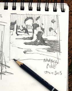
Narpyn Pine - plein air oil painting
I finally got around to photographing my most-recent paintings, so here's the first of three updates.
These all come from a farming property, Narpyn, not far from home. It's a place I've driven past for more than ten years but never got around to visiting. Last week I decided it was time I go and knock on the door and see if I could take a look around the place and do some paintings.
The owners were more than happy for me to do just that.
The property offers all sorts of painting opportunities including a winter creek, large trees, wide vistas, old buildings and sheep, lots of sheep. I hope to use it as a chance to develop my style a little further - particularly pushing the boundaries between realism, impressionism and abstraction.
My first painting, however, was pretty safe and I didn't push too far from my existing style - although it is a square format which is very unusual for me.
I knew the shadows I was seeing wouldn't stay put for long so I began with a thumbnail...
I started the painting by laying down some basic shadow tones. This stage is quite similar to the thumbnail and provides the foundation for everything that follows...

Stage 2 is mostly about mid-tones and local colour. The under-painting is also strengthened at this stage....

As work progressed, I found myself repeatedly turning to the pencil thumbnail to check where shadows were supposed to be. Here's the finished piece....

I did video my progress on this painting so I may put it up on Youtube sometime soon. I just need a few quiet rainy days to get the editing and voice-over work done.
These all come from a farming property, Narpyn, not far from home. It's a place I've driven past for more than ten years but never got around to visiting. Last week I decided it was time I go and knock on the door and see if I could take a look around the place and do some paintings.
The owners were more than happy for me to do just that.
The property offers all sorts of painting opportunities including a winter creek, large trees, wide vistas, old buildings and sheep, lots of sheep. I hope to use it as a chance to develop my style a little further - particularly pushing the boundaries between realism, impressionism and abstraction.
My first painting, however, was pretty safe and I didn't push too far from my existing style - although it is a square format which is very unusual for me.
I knew the shadows I was seeing wouldn't stay put for long so I began with a thumbnail...

I started the painting by laying down some basic shadow tones. This stage is quite similar to the thumbnail and provides the foundation for everything that follows...

Stage 2 is mostly about mid-tones and local colour. The under-painting is also strengthened at this stage....

As work progressed, I found myself repeatedly turning to the pencil thumbnail to check where shadows were supposed to be. Here's the finished piece....

Narpyn pine.
Plein air painting. 30x30cm oil on board.
© Andy Dolphin
Plein air painting. 30x30cm oil on board.
© Andy Dolphin
I did video my progress on this painting so I may put it up on Youtube sometime soon. I just need a few quiet rainy days to get the editing and voice-over work done.
Sunday, June 23, 2013
Winter Light - plein air video
It's winter down here in the southern hemisphere so it's been a bit cold and damp lately. However, a few days ago we had scattered showers combined with moments of bright sunlight and this made for interesting painting conditions.

I found a spot beside the highway with a view across farmland to the Porongurup Range. There were clouds draped over the peaks of the range and a strip of sunlight lit up a distant paddock. It was a scene ready for painting and it looked like an interesting subject for my second plein air painting video.
Luckily, the rain held off long enough for me to get the sketch done.
NOTE: You can watch the video here on the blog but I'd recommend going to Youtube and viewing it at full size (click the little "cog" symbol and choose 480p if your internet connection can cope).
Thanks again to Kevin MacLeod, who offers hundreds of royalty-free music tracks on his Incompotech website.
You can see my first painting video, Barrow Road, on Youtube too.

Winter Light.
Plein air sketch. 30x25cm oil on board.
© Andy Dolphin
Plein air sketch. 30x25cm oil on board.
© Andy Dolphin
I found a spot beside the highway with a view across farmland to the Porongurup Range. There were clouds draped over the peaks of the range and a strip of sunlight lit up a distant paddock. It was a scene ready for painting and it looked like an interesting subject for my second plein air painting video.
Luckily, the rain held off long enough for me to get the sketch done.
NOTE: You can watch the video here on the blog but I'd recommend going to Youtube and viewing it at full size (click the little "cog" symbol and choose 480p if your internet connection can cope).
Thanks again to Kevin MacLeod, who offers hundreds of royalty-free music tracks on his Incompotech website.
You can see my first painting video, Barrow Road, on Youtube too.
Sunday, April 21, 2013
VIDEO - plein air landscape in oils
With scattered cloud hanging around on Friday, I headed back out to Barrow Road, where I completed a grey-day plein air landscape last week. I was planning to paint the view from the opposite side of the road and hoped for some sunlight and shadows this time. I got both.
Here's this week's painting.

I decided to try something different this time, and set up a camera on a tripod to capture video of my progress.
As a result, I've spent the weekend getting a crash course in Adobe Premiere Pro from my son. I think I've spent around 20 times longer editing the video as I spent doing the painting. But I'm super-pleased with the result.
So here you go. It's nine minutes long so make sure you've got a cup of tea handy. Sit back and relax.
NOTE: You can watch it here on the blog but I'd recommend going to Youtube and viewing it at full size.
I didn't take a final location photo of the painting, but I think the video gives a reasonable idea that it probably was painted on site :)
I have to give thanks to Kevin MacLeod, who offers hundreds of royalty-free music tracks on his Incompotech website.
Let me know what you think.
Here's this week's painting.

(Barrow Road. Plein air sketch. 30x25cm oil on board. © Andy Dolphin)
I decided to try something different this time, and set up a camera on a tripod to capture video of my progress.
As a result, I've spent the weekend getting a crash course in Adobe Premiere Pro from my son. I think I've spent around 20 times longer editing the video as I spent doing the painting. But I'm super-pleased with the result.
So here you go. It's nine minutes long so make sure you've got a cup of tea handy. Sit back and relax.
NOTE: You can watch it here on the blog but I'd recommend going to Youtube and viewing it at full size.
I didn't take a final location photo of the painting, but I think the video gives a reasonable idea that it probably was painted on site :)
I have to give thanks to Kevin MacLeod, who offers hundreds of royalty-free music tracks on his Incompotech website.
Let me know what you think.
Thursday, March 7, 2013
Misery in the studio
I liked my little plein air oil study of Misery Beach so much that I decided to do a bigger version in the studio.
I added a few extra colours to the palette for this one just to give me a few more options for playing warms against cools. One downside to a three-colour palette, like I used on the study, is that all colours, whether in light or in shadow, have to be mixed from the same base set. It delivers a level of unity to the finished painting but reduces the opportunity to reinforce contrasts.
So I added a cadmium yellow, cerulean blue and permanent crimson to the original ultramarine, burnt sienna and yellow ochre. The cad yellow would find itself added to most sunlit areas and the crimson gives me wonderfully purplish shadows on the sand.
Here's the main stages the painting went through. You'll notice that I gave the primed board a wash of yellow ochre before I started.

Here's the "finished" piece.

I'm not entirely convinced I'm finished with it just yet. Time will tell.
I added a few extra colours to the palette for this one just to give me a few more options for playing warms against cools. One downside to a three-colour palette, like I used on the study, is that all colours, whether in light or in shadow, have to be mixed from the same base set. It delivers a level of unity to the finished painting but reduces the opportunity to reinforce contrasts.
So I added a cadmium yellow, cerulean blue and permanent crimson to the original ultramarine, burnt sienna and yellow ochre. The cad yellow would find itself added to most sunlit areas and the crimson gives me wonderfully purplish shadows on the sand.
Here's the main stages the painting went through. You'll notice that I gave the primed board a wash of yellow ochre before I started.

Here's the "finished" piece.

(Misery Beach Dunes. 48x35cm oil on board. © Andy Dolphin)
I'm not entirely convinced I'm finished with it just yet. Time will tell.
Sunday, February 10, 2013
Evolution of a seacape in oil - VI
My latest studio painting brings together all the experiences I've enjoyed, so far, since last August in my pursuit of the perfect seascape. I've blogged the challenge which began with the Genesis of a seascape in oils and later transitioned into the Evolution of a seascape in oil series.
The journey to date has involved taking thousands of photographs and shooting some video footage of the local coastline at various times of day and in differing weather conditions. I've also completed dozens of plein air studies of waves and rocky shores and studied seascapes by other artists, both historical and contemporary.
My primary focus has been to not just recreate a photograph of the sea, but to capture the energy of the local coastline in paint through the use of a strong abstract foundation.
Here are the three stages in my newest work...

Working from a photographic reference, I used Liquol (an alkyd medium by Art Spectrum) and solvent to reduce the paint and laid in my initial tonal washes. There's some early thought here about warm and cool areas.

Starting with the sky, the most distant part of the scene, I began adding body paint. In the foreground, I concentrated on the major shadow masses. Highlights will be added later.
Even at this early stage, you might see that I'm employing direction lines. The most obvious lead-in is the dark mass of rock pointing straight to the crashing wave. Highlights will break this mass up a little. I've also incorporated a "Z" shape in the white foam. This path starts at bottom-centre, moves up to the left and then turns right, past the focal point, before heading toward the distant headland where it returns the eye back to the centre of interest.

Here's how the painting finished up with highlights and shadow detail added. It captures that moment on a cloudy day when the sun manages to break through and light things up for a moment. There's a storm brewing in the distance sending a barrage of waves to batter a heavy and unmoving rocky coast. This is when the sea is, to me, at its very best.
To increase the energy of the scene, I've dropped the viewpoint somewhat below the level where I actually stood to take the reference photo. I couldn't possibly have stood this far down the rocks and remained dry - or safe - but I wanted to capture the feeling of being there. Lowering the viewpoint in this way requires some reorganising of the elements in order to correct the perspective - but the results are worth the time and effort.
The journey continues.
Seascape oil painting series:
Genesis of a seascape in oil - I
Genesis of a seascape in oil - II
Genesis of a seascape in oil - III
Evolution of a seascape in oil - IV
Evolution of a seascape in oil - V
Evolution of a seascape in oil - VI
The journey to date has involved taking thousands of photographs and shooting some video footage of the local coastline at various times of day and in differing weather conditions. I've also completed dozens of plein air studies of waves and rocky shores and studied seascapes by other artists, both historical and contemporary.
My primary focus has been to not just recreate a photograph of the sea, but to capture the energy of the local coastline in paint through the use of a strong abstract foundation.
Here are the three stages in my newest work...

Working from a photographic reference, I used Liquol (an alkyd medium by Art Spectrum) and solvent to reduce the paint and laid in my initial tonal washes. There's some early thought here about warm and cool areas.

Starting with the sky, the most distant part of the scene, I began adding body paint. In the foreground, I concentrated on the major shadow masses. Highlights will be added later.
Even at this early stage, you might see that I'm employing direction lines. The most obvious lead-in is the dark mass of rock pointing straight to the crashing wave. Highlights will break this mass up a little. I've also incorporated a "Z" shape in the white foam. This path starts at bottom-centre, moves up to the left and then turns right, past the focal point, before heading toward the distant headland where it returns the eye back to the centre of interest.

(South coastal. 70x37cm oil on board. © Andy Dolphin)
Here's how the painting finished up with highlights and shadow detail added. It captures that moment on a cloudy day when the sun manages to break through and light things up for a moment. There's a storm brewing in the distance sending a barrage of waves to batter a heavy and unmoving rocky coast. This is when the sea is, to me, at its very best.
To increase the energy of the scene, I've dropped the viewpoint somewhat below the level where I actually stood to take the reference photo. I couldn't possibly have stood this far down the rocks and remained dry - or safe - but I wanted to capture the feeling of being there. Lowering the viewpoint in this way requires some reorganising of the elements in order to correct the perspective - but the results are worth the time and effort.
The journey continues.
Seascape oil painting series:
Genesis of a seascape in oil - I
Genesis of a seascape in oil - II
Genesis of a seascape in oil - III
Evolution of a seascape in oil - IV
Evolution of a seascape in oil - V
Evolution of a seascape in oil - VI
Sunday, January 27, 2013
Evolution of a seacape in oil - V
I have actually been doing a bit of painting recently but all of it has been in the studio and has involved revisiting old paintings that never "made the cut".
This isn't something I have done a lot of in the past but lately I've been driven to discover why some paintings end up on "the pile in the corner", instead of hanging in a frame. So I've been looking through that pile to see where I can spot obvious design errors as, in many cases, this is where a painting fails.
One of the pieces I looked at this week was a painting of Lights Beach I did in March last year.

This painting was done as an exercise, from photographic references, and I have messed with it several times in the last 10 months, playing with shapes and contrasts to see if I could get more out of it. My main interest early on was the depiction of the foam trails breaking up as the transparent water rises into the main wave.
It is fairly true to the photos but I always felt it was a little contradictory as it portrayed a supposedly large threatening wave but was, at the same time, bright and sunny. My biggest issue with it, however, was the relatively horizontal feeling of the design, the detachment of the rocky areas and the lack of a path through the painting to the focal point. There is a path there, through the greenish water to the peak of the wave, but it's very subtle and doesn't act to connect to the foreground to the middle ground.
I've painted quite a few plein air wave studies since last March and I feel I'm in a better position now to incorporate some of that experience into future seascapes.
I put the small painting on my easel and gave it a light coating of alkyd medium to wet the surface and bring the painting back to life. With just a few colours on the palette, I spent about half an hour loosely "sculpting" paint over the old painting. Abandoning my earlier focus on the transparent part of the wave, I altered shapes and shadows in an attempt to get a more dynamic composition and more of a feeling of power in the surf.
Here's where it's at now...

It's pretty loose, with some areas almost completely unresolved, but that's okay for this painting. What matters more is that the foreground and middle ground are now decidedly interconnected and that there is a feeling of powerful movement in both the foreground and mid-ground water.
While it is no longer exactly like the original photo reference, it is still true to the location and captures the feeling of the place much better. It feels like it has potential now and I'll visit it again soon in order to tidy a few things up.
The revised painting now becomes stage 5 in my Evolution of a seascape in oil series.
Seascape oil painting series:
Genesis of a seascape in oil - I
Genesis of a seascape in oil - II
Genesis of a seascape in oil - III
Evolution of a seascape in oil - IV
Evolution of a seascape in oil - V
Evolution of a seascape in oil - VI
This isn't something I have done a lot of in the past but lately I've been driven to discover why some paintings end up on "the pile in the corner", instead of hanging in a frame. So I've been looking through that pile to see where I can spot obvious design errors as, in many cases, this is where a painting fails.
One of the pieces I looked at this week was a painting of Lights Beach I did in March last year.

(Breaker at Lights Beach - sketch. 30x20cm oil on board. © Andy Dolphin)
This painting was done as an exercise, from photographic references, and I have messed with it several times in the last 10 months, playing with shapes and contrasts to see if I could get more out of it. My main interest early on was the depiction of the foam trails breaking up as the transparent water rises into the main wave.
It is fairly true to the photos but I always felt it was a little contradictory as it portrayed a supposedly large threatening wave but was, at the same time, bright and sunny. My biggest issue with it, however, was the relatively horizontal feeling of the design, the detachment of the rocky areas and the lack of a path through the painting to the focal point. There is a path there, through the greenish water to the peak of the wave, but it's very subtle and doesn't act to connect to the foreground to the middle ground.
I've painted quite a few plein air wave studies since last March and I feel I'm in a better position now to incorporate some of that experience into future seascapes.
I put the small painting on my easel and gave it a light coating of alkyd medium to wet the surface and bring the painting back to life. With just a few colours on the palette, I spent about half an hour loosely "sculpting" paint over the old painting. Abandoning my earlier focus on the transparent part of the wave, I altered shapes and shadows in an attempt to get a more dynamic composition and more of a feeling of power in the surf.
Here's where it's at now...

(Breaker at Lights Beach - sketch. 30x20cm oil on board. © Andy Dolphin)
It's pretty loose, with some areas almost completely unresolved, but that's okay for this painting. What matters more is that the foreground and middle ground are now decidedly interconnected and that there is a feeling of powerful movement in both the foreground and mid-ground water.
While it is no longer exactly like the original photo reference, it is still true to the location and captures the feeling of the place much better. It feels like it has potential now and I'll visit it again soon in order to tidy a few things up.
The revised painting now becomes stage 5 in my Evolution of a seascape in oil series.
Seascape oil painting series:
Genesis of a seascape in oil - I
Genesis of a seascape in oil - II
Genesis of a seascape in oil - III
Evolution of a seascape in oil - IV
Evolution of a seascape in oil - V
Evolution of a seascape in oil - VI
Friday, October 26, 2012
Lowlands Beach - plein air oil
With clear skies and moderate temperatures forecast, I headed back to Lowlands Beach (near Denmark, Western Australia) yesterday afternoon.
I parked at the top lookout on the eastern side of the main beach. The lookout is about 50m above the sea and offers views across the main bay and to the rocky point below.
I watched the waves for a while, not entirely convinced I was going to get a painting out of it. But then I focussed on one large rock below the lookout and, although it was a reasonable distance away, I thought it was worth a shot at painting.
Here's the scene as the camera saw it at 50mm zoom, which approximates our normal field of view. I'm about 50m up and the clear blue water is about 60m from the cliff I'm standing on - so, according to Pythagoras, that vertical boulder to the right of centre is about 78m away from me.

As you can see, there's a lot going on with all those rocks so my first major decision was to choose the boundaries for the painting. I rarely do thumbnail sketches – I should do them, but I don't – but this time I thought it would be wise to plan ahead a little. I chose to focus on the vertical boulder and small area of white water in the centre of the view (the blunt HB pencil in the photo below is for illustrative purposes only, if you'll pardon the pun. It's not the pencil I used but gives you an idea of scale).

The thumbnail sketch suggested that I should pay attention to the strong contrast between the foamy white water and the adjacent rocks and clear water. I could use the whitewater to draw the eye in to the main rock. I made the decision at this point to alter the relative size of the rocks near the middle and to the left so that they didn't all end up the same size. I also decided that I should keep the two central rocks grouped as a single unit. I was also captivated by the lengthening shadows cast on the white water by the rocks and decided these would help to hold all the rocks together giving me a large interesting dark shape rather than a scattered collection of bits.
That's quite a few decisions from a one-minute sketch - and it's more decisions than I usually make before starting to paint. I really should do thumbnails more often, I'd probably waste a lot less paint!
I began by washing in the major darks on a white-primed panel. I wiped back a couple of highlight areas in the rocks and there's a hint of swell out in the open water.

Next I laid in the the white water using a purple-blue for the shaded parts and a warmer green-blue for where the sun would be hitting. It was important to lock this down fairly early as it wouldn't be long before all the foreground white water would be in shadow. You'll notice I dragged the foam over the clear water to create an interesting transition zone. I was feeling pretty positive at this stage.

Here's the obligatory location shot of the painting as it was when I packed up. It was getting dark by now and although the sunset was beautiful, there's no sunlight shining on the rocks below any more.

Below is the finished painting in daylight. I barely touched it in the studio so it's about 99.9% as it was on site. If you squint, you'll see how the shadow area on the white water becomes part of the dark tone of the rock mass. It can be tough to get that tone right because we tend to perceive even the shadow areas of white foam as very light. Squinting at the scene is the key to getting it right.

I will probably lop a couple of centimetres off the top of this painting as there's nothing of interest up there, plus the image is split almost 50/50 diagonally and the tall rock feels too low in the frame. I knew all this early on (my thumbnail is a better shape) but that's the board I had with me so I just went with it. If I chop it, I'll end up with something like this.

Much nicer proportions, I think.
Of course, sawing a piece off a panel is pretty trivial (unless the saw slips but let's not go there). Real problems arise, however, if you finish a painting then realise you need to make the panel bigger – so try to avoid that eh?
I parked at the top lookout on the eastern side of the main beach. The lookout is about 50m above the sea and offers views across the main bay and to the rocky point below.
I watched the waves for a while, not entirely convinced I was going to get a painting out of it. But then I focussed on one large rock below the lookout and, although it was a reasonable distance away, I thought it was worth a shot at painting.
Here's the scene as the camera saw it at 50mm zoom, which approximates our normal field of view. I'm about 50m up and the clear blue water is about 60m from the cliff I'm standing on - so, according to Pythagoras, that vertical boulder to the right of centre is about 78m away from me.

As you can see, there's a lot going on with all those rocks so my first major decision was to choose the boundaries for the painting. I rarely do thumbnail sketches – I should do them, but I don't – but this time I thought it would be wise to plan ahead a little. I chose to focus on the vertical boulder and small area of white water in the centre of the view (the blunt HB pencil in the photo below is for illustrative purposes only, if you'll pardon the pun. It's not the pencil I used but gives you an idea of scale).

The thumbnail sketch suggested that I should pay attention to the strong contrast between the foamy white water and the adjacent rocks and clear water. I could use the whitewater to draw the eye in to the main rock. I made the decision at this point to alter the relative size of the rocks near the middle and to the left so that they didn't all end up the same size. I also decided that I should keep the two central rocks grouped as a single unit. I was also captivated by the lengthening shadows cast on the white water by the rocks and decided these would help to hold all the rocks together giving me a large interesting dark shape rather than a scattered collection of bits.
That's quite a few decisions from a one-minute sketch - and it's more decisions than I usually make before starting to paint. I really should do thumbnails more often, I'd probably waste a lot less paint!
I began by washing in the major darks on a white-primed panel. I wiped back a couple of highlight areas in the rocks and there's a hint of swell out in the open water.

Next I laid in the the white water using a purple-blue for the shaded parts and a warmer green-blue for where the sun would be hitting. It was important to lock this down fairly early as it wouldn't be long before all the foreground white water would be in shadow. You'll notice I dragged the foam over the clear water to create an interesting transition zone. I was feeling pretty positive at this stage.

Here's the obligatory location shot of the painting as it was when I packed up. It was getting dark by now and although the sunset was beautiful, there's no sunlight shining on the rocks below any more.

Below is the finished painting in daylight. I barely touched it in the studio so it's about 99.9% as it was on site. If you squint, you'll see how the shadow area on the white water becomes part of the dark tone of the rock mass. It can be tough to get that tone right because we tend to perceive even the shadow areas of white foam as very light. Squinting at the scene is the key to getting it right.

(Lowlands rocks. Plein air sketch. 30x25cm oil on board. © Andy Dolphin)
I will probably lop a couple of centimetres off the top of this painting as there's nothing of interest up there, plus the image is split almost 50/50 diagonally and the tall rock feels too low in the frame. I knew all this early on (my thumbnail is a better shape) but that's the board I had with me so I just went with it. If I chop it, I'll end up with something like this.

(Lowlands rocks, edited. © Andy Dolphin)
Much nicer proportions, I think.
Of course, sawing a piece off a panel is pretty trivial (unless the saw slips but let's not go there). Real problems arise, however, if you finish a painting then realise you need to make the panel bigger – so try to avoid that eh?
Saturday, August 18, 2012
Evolution of a seascape in oil - IV
This is part four in a series which began with "Genesis of a seascape in oil". In parts one to three, I explained how I took an abstract concept sketch, done in Photoshop, and developed it into a detailed reference for a seascape painting. We are now looking at how these early stages will evolve into a finished oil painting.
Here's where we finished in step three.

Except for the rocks, this image is all digital painting. I took this into the studio and used it to create a 255 x 355mm painting in oils. For the initial painting, I used just ultramarine, burnt sienna and yellow ochre as I was more interested in shapes and overall design at this point and didn't want to get bogged down in colour decisions. I used a little lean medium to help the paint to dry a bit faster.

I let this dry for a few days and looked at it whenever I entered the studio. I also checked it out in a mirror and this showed up a few things that needed some attention. I put it back on the easel and, with a few extra colours on the palette, I worked over most of the picture, making subtle adjustments to shapes and edges and pushing some colours and contrasts.

Here's how the painting stands at the moment.
I warmed up the rocks to give me a stronger colour contrast, warm against cool, orange against blue. I've also done quite a lot of modelling to create more interesting shapes within the rock mass. I've also adjusted the shape of the line where the rocks meet the water as it was too geometric before. As I mentioned in part three of this series, the strip of foam that weaves its way up from the bottom of the picture is an important part of the composition. In the under-painting it was rather solid and needed breaking up a little to make it more a part of the water's surface.
Here's a tonal map of the painting, created using Photoshop's posterize feature.

Part five coming soon.
Seascape oil painting series:
Genesis of a seascape in oil - I
Genesis of a seascape in oil - II
Genesis of a seascape in oil - III
Evolution of a seascape in oil - IV
Evolution of a seascape in oil - V
Evolution of a seascape in oil - VI
Here's where we finished in step three.
Except for the rocks, this image is all digital painting. I took this into the studio and used it to create a 255 x 355mm painting in oils. For the initial painting, I used just ultramarine, burnt sienna and yellow ochre as I was more interested in shapes and overall design at this point and didn't want to get bogged down in colour decisions. I used a little lean medium to help the paint to dry a bit faster.

I let this dry for a few days and looked at it whenever I entered the studio. I also checked it out in a mirror and this showed up a few things that needed some attention. I put it back on the easel and, with a few extra colours on the palette, I worked over most of the picture, making subtle adjustments to shapes and edges and pushing some colours and contrasts.

Here's how the painting stands at the moment.
I warmed up the rocks to give me a stronger colour contrast, warm against cool, orange against blue. I've also done quite a lot of modelling to create more interesting shapes within the rock mass. I've also adjusted the shape of the line where the rocks meet the water as it was too geometric before. As I mentioned in part three of this series, the strip of foam that weaves its way up from the bottom of the picture is an important part of the composition. In the under-painting it was rather solid and needed breaking up a little to make it more a part of the water's surface.
Here's a tonal map of the painting, created using Photoshop's posterize feature.

Part five coming soon.
Seascape oil painting series:
Genesis of a seascape in oil - I
Genesis of a seascape in oil - II
Genesis of a seascape in oil - III
Evolution of a seascape in oil - IV
Evolution of a seascape in oil - V
Evolution of a seascape in oil - VI
Tuesday, August 14, 2012
Genesis of a seascape in oil - III
This is part three in a series of designing a seascape painting in oils. Click the link for part two.
Here's where we got up to. It's a fairly basic seascape design, painted roughly in Photoshop, plus a small oil sketch created using the digital painting as a reference.


My imaginary rocks could use a little assistance and I feel the format of the picture is too wide with the main body of the wave directing the eye straight across from left to right, until it hits the rock. I decided the picture could use more foreground to offer a better opportunity for a more interesting lead-in, to reduce the horizontal force of that wave.
To help out with the rocks, I looked through my photos of the local coastline and found a rather nice looking rocky outcrop. Then I flipped the rough digital painting right-to-left - for no great reason other than that happened to fit with the way the rocks faced - then I cut out the rocks from the photo and put the two images together.

Some of you might be thinking "that's cheating", but all I'm doing here is assembling ideas and most of us have used photo references for years. I could just as easily have sketched the rocks digitally, using the photo as a reference, but there was no point in doing that for this exercise.
I refined the image some more in Photoshop, still keeping my mind on the overall design, rather than "the seascape".
The foreground water, the semi-submerged rock in the lower-right corner and the distant headland and clouds are painted digitally. I've also added some water running off the main rock area because my waves are much bigger than those in the photo reference. The main addition here, however, is that strip of sheet foam that snakes gently up from the bottom of the picture to the focal point. This was designed, quite purposefully, to lead the viewer in. I spent quite a lot of time on that one feature.
I warmed the rocks up a little to boost the contrast between them and the overall cool blue colour scheme. Here's the tonal map of the image at the end of the digital design process.

This has given me a pretty good scene to work with. With the extra foreground, the dark masses now take up most of the area followed by mid tones then highlights. The strongest contrast is still where the big splash meets the rocks.
The next step is to turn this digital composite into an oil painting.
I'll post part four soon.
Seascape oil painting series:
Genesis of a seascape in oil - I
Genesis of a seascape in oil - II
Genesis of a seascape in oil - III
Evolution of a seascape in oil - IV
Evolution of a seascape in oil - V
Evolution of a seascape in oil - VI
Subscribe to:
Posts (Atom)