Sunday, October 28, 2012

Bluff Knoll - plein air oil

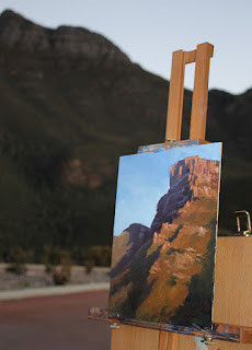
It was very warm yesterday with clear blue skies in every direction. I took the opportunity to head inland looking for something to paint. With one month of spring to go, the paddocks are starting to lose their winter greens and take on the warm, dry colours of summer. I drove around for a few hours before ending up at Bluff Knoll, the highest peak in southwest Western Australia.

I painted here one morning a year ago (see Bluff Knoll) and in January this year (See Bluff Knoll in January) and while I was happy enough with the sketches I'd done on both occasions, I felt it was worth another go to try and capture the essence of the bluff.

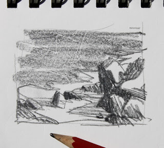
By the time I'd set up my easel, there was only about half an hour left until sunset. I decided a thumbnail sketch was in order to ensure I knew where I was headed before the light changed too much.

thumbnail sketch - bluff knoll

I tried two formats, each sketch taking less than a minute. I decided that the vertical format gave me a better feeling of the towering nature of the mountain. I was particularly interested in the zig-zag line created where the major shadow area met the sunlit area. There's a very interesting piece of geology up there, where the sandstone forms a turret-like ridge that catches the sunlight, but it would fall almost dead centre in my picture so I couldn't make too much of it and decided, instead, to draw the eye up to the cliff face.

I quickly washed in my major shadow area with a mixture of ultramarine and crimson, thinned with low-odour mineral spirits. Then I assessed the colour of the sunlit areas. This is one of those confusing situations where you know the shrubbery on the mountain is green but the light shining on it leans strongly toward red - green's complement. So what colour is it now? It's a sort of red-green-yellow-orange-brown colour.

I used my handy-dandy oil colour chart to find a starting point and settled on a combination of cerulean blue (a green-blue), mixed with cadmium yellow deep (an orange-yellow) and added permanent crimson (a purple-red) to warm it up. I washed a mix of burnt sienna and permanent crimson on the sunlit area first to provide a warm, earthy base for this "green".

I approached this painting a little differently to how I usually paint on site. I didn't try to take any area toward a finished state and just laid in large areas of general colour until almost all the white primer was covered. I didn't even take these areas up to each other, at first. Once I had it all mapped in, I went back over all areas with heavier colour and closed all the gaps that I'd left in the early stage.

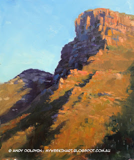
Bluff Knoll - plein air oil painting by Andy Dolphin

The shadows moved fast and I found the thumbnail sketch an invaluable map of where I was headed. You can see in the thumbnail that I'd noted a small patch of sunlight right at the top of the shaded cliff face. This highlight disappeared soon after I started painting so the sketch was a useful reminder to include it - and it is important to making that area interesting enough to look at.

I finished painting after sunset and had to use a small headlamp to see what I was doing as I added small flashes of colour to break up the large masses. I used a flash to take the location photo, above, just before I finished working on the painting.

Here's how things ended up with almost no work added in the studio...

Bluff Knoll - plein air oil painting by Andy Dolphin
 (Spring evening - Bluff Knoll. Plein air sketch.
25x30cm oil on board. © Andy Dolphin)

Spam in art


I'm getting a lot of spam lately from overseas companies selling cheap reproductions of paintings. I've deleted five comments in two days.

The comments are usually repetitious (the same comment is often posted to several articles on one blog and you'll usually find identical comments on other people's blogs), and have nothing to do with the articles they're posted to – showing that the person (or robot) posting the comment has no interest in the blog articles but is simply hoping to direct blog readers to their own site via free advertising. They hope to trade off the blogger's popularity.

If you get these comments on your own blog, can I suggest that you delete them too so as not to encourage the practice?

UPDATE:
Elizabeth Tyler has a bit more to say about these likely art scammers on her blog.

Friday, October 26, 2012

Lowlands Beach - plein air oil

With clear skies and moderate temperatures forecast, I headed back to Lowlands Beach (near Denmark, Western Australia) yesterday afternoon.

I parked at the top lookout on the eastern side of the main beach. The lookout is about 50m above the sea and offers views across the main bay and to the rocky point below.

I watched the waves for a while, not entirely convinced I was going to get a painting out of it. But then I focussed on one large rock below the lookout and, although it was a reasonable distance away, I thought it was worth a shot at painting.

Here's the scene as the camera saw it at 50mm zoom, which approximates our normal field of view. I'm about 50m up and the clear blue water is about 60m from the cliff I'm standing on - so, according to Pythagoras, that vertical boulder to the right of centre is about 78m away from me.

Lowlands Beach, Albany-Denmark, WA. Photo by Andy Dolphin

As you can see, there's a lot going on with all those rocks so my first major decision was to choose the boundaries for the painting. I rarely do thumbnail sketches – I should do them, but I don't – but this time I thought it would be wise to plan ahead a little. I chose to focus on the vertical boulder and small area of white water in the centre of the view (the blunt HB pencil in the photo below is for illustrative purposes only, if you'll pardon the pun. It's not the pencil I used but gives you an idea of scale).

Lowlands Beach thumbnail sketch

The thumbnail sketch suggested that I should pay attention to the strong contrast between the foamy white water and the adjacent rocks and clear water. I could use the whitewater to draw the eye in to the main rock. I made the decision at this point to alter the relative size of the rocks near the middle and to the left so that they didn't all end up the same size. I also decided that I should keep the two central rocks grouped as a single unit. I was also captivated by the lengthening shadows cast on the white water by the rocks and decided these would help to hold all the rocks together giving me a large interesting dark shape rather than a scattered collection of bits.

That's quite a few decisions from a one-minute sketch - and it's more decisions than I usually make before starting to paint. I really should do thumbnails more often, I'd probably waste a lot less paint!

I began by washing in the major darks on a white-primed panel. I wiped back a couple of highlight areas in the rocks and there's a hint of swell out in the open water.

Plein air oil painting seascape, step by step, by Andy Dolphin.

Next I laid in the the white water using a purple-blue for the shaded parts and a warmer green-blue for where the sun would be hitting. It was important to lock this down fairly early as it wouldn't be long before all the foreground white water would be in shadow. You'll notice I dragged the foam over the clear water to create an interesting transition zone. I was feeling pretty positive at this stage.

Plein air oil painting seascape, step by step, by Andy Dolphin.

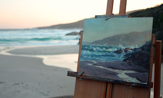
Here's the obligatory location shot of the painting as it was when I packed up. It was getting dark by now and although the sunset was beautiful, there's no sunlight shining on the rocks below any more.

Lowlands, Denmark, WA. Plein air oil painting seascape by Andy Dolphin.

Below is the finished painting in daylight. I barely touched it in the studio so it's about 99.9% as it was on site. If you squint, you'll see how the shadow area on the white water becomes part of the dark tone of the rock mass. It can be tough to get that tone right because we tend to perceive even the shadow areas of white foam as very light. Squinting at the scene is the key to getting it right.

Lowlands Beach rocks, near Albany, WA. Plein air oil painting seascape by Andy Dolphin.
 (Lowlands rocks. Plein air sketch. 30x25cm oil on board. © Andy Dolphin)

I will probably lop a couple of centimetres off the top of this painting as there's nothing of interest up there, plus the image is split almost 50/50 diagonally and the tall rock feels too low in the frame. I knew all this early on (my thumbnail is a better shape) but that's the board I had with me so I just went with it. If I chop it, I'll end up with something like this.

Lowlands Beach rocks, near Albany, WA. Edited plein air oil painting seascape by Andy Dolphin.
 (Lowlands rocks, edited. © Andy Dolphin)

Much nicer proportions, I think.

Of course, sawing a piece off a panel is pretty trivial (unless the saw slips but let's not go there). Real problems arise, however, if you finish a painting then realise you need to make the panel bigger – so try to avoid that eh?

Sunday, October 21, 2012

Plein air oils in springtime

A few days ago I decided to head down to Denmark in the hope of finding a new painting location. I got distracted along the way and ended up driving down some back tracks for a few hours. It was cloudy, so I didn't mind too much as I still find cloudy days difficult for painting plein air. And I did find some nice areas of filled with wildflowers and some interesting places for future reference.

I eventually made it to Lowlands Beach. The surf was "pumping", more than I'd seen it here before, but it was too late to start painting so I just wandered around with the camera and took it all in.

Yesterday was fine and warm so I headed back to Lowlands Beach.

I got distracted again.

I stopped to take a look at the Youngs Siding General Store because it looks like something I might want to paint. While I was staring at it, and tossing up the possibility of painting it, I noticed a small cottage to my right. The sunlight was hitting it hard - I got the easel out and got to work.

Here's the on-location shot...


...and here's the end result. I'm pretty happy with it as this is not a typical subject for me and I captured the glow of the white picket fence, the thing that caught my eye in the first place...

Blue House, Youngs Siding. Plein air oil painting by Andy Dolphin.
(The Blue House. Plein air sketch. 30x25cm oil on board. © Andy Dolphin)

I made a couple of "executive decisions" on this one. The cottage had a fairly new roof, but I chose to make it older. The shrub on the right is much bigger than I painted it - you can see it in the location shot. I wanted to see a bit more of the roof so I pruned the shrub down a fair bit. I'm happy with both decisions.

It was still fairly early, so I packed up and continued on to Lowlands. This time I took my easel with me, down the steps to the beach. So there was no excuse not to paint something.

It took a while to decide which way to face. I sat and stared and wandered around for quite a while before settling on this view of the semi-permanent creek that flows out of the sand dunes, down to the ocean.

Lowlands Beach, Denmark. Plein air oil painting by Andy Dolphin.

Lowlands Beach, Denmark. Plein air oil painting by Andy Dolphin.
(Lowlands. Plein air sketch. 30x25cm oil on board. © Andy Dolphin)

I used a limited palette and almost threw the paint on the primed panel. I think there's about half-an-hour's work here - no time for major "executive decisions".

I'm  happy with the feeling of light in this sketch, especially the glow behind the foreground rocks and across the breakers. They were my combined subjects. If I had a little more time, I'd try to do something with the "lump" of rocks on the right. Next time.

The other, other me...

On this blog I'm an oil painter and sometimes digital artist. The other me is a graphic artist and production manager at a regional newspaper. This article is about the other, other me - the amateur thespian.

When I'm not painting, or working at my "real" job, I spend a bit of time on stage.

I joined the Plantagenet Players repertory group shortly after moving to Mt Barker nine years ago. I soon became the resident artist, working on sets and promotional material.

I've just been working on the poster for our latest production, which opens next month, and it got me thinking back over my "almost decade" with Players - and about the posters I've designed along the way. And then I thought, "why not share them on the blog?".

So here you go. A selection of posters from the last half-dozen years or so. All artwork is original. No clip art here.

2006

 
2007

  2007 (A joke poster - not used. Pity.)

2008

2009

 2011

2011

 2012  

Next year, Plantagenet Players celebrate their 60th anniversary. Formed in 1953, they've staged at least one production every year since – making them, I believe, the longest, continuous-running repertory group in Western Australia.

I'll return you to normal programming shortly.

Thursday, October 18, 2012

A little about brushwork

When I first switched from commercial to fine art, I tended to paint with almost painstaking attention to detail. I used fine brushes and painted leaves on shrubbery in forest landscapes or feathers on portraits of birds. It was a hangover from my days working as an illustrator.

My style has evolved over the last decade, with small breakthroughs in technique occurring every couple of years. It's taken me a long time to loosen up but the last year has seen me become more comfortable with producing loose-looking brushwork.

This particular breakthrough probably came about as a result of a combination of factors:
  • Painting outdoors far more often
  • Forcing myself to simplify
  • Doing a lot of small paintings
  • Setting time limits on some paintings
  • Using three brushes, or less
  • Rarely using "small" brushes
I switched to using chisel-edged, flat synthetic brushes about a year ago. I'd discovered such a brush that I'd owned for years but never used. I tried it, liked it and bought a few more. I've rarely touched my old bristle brushes since (and several of them should probably be binned anyway).

I mention all this because I was speaking to a friend last night who was giving me her assessment of some of my work. The paintings that really caught her eye were the more expressive ones, with loose brushwork. She felt they had more "personality" – a bit more of "me".

With that in mind, I thought I'd post a close-up of the karri tree painting I did last week. Here's some of the brushwork in the shrubbery at the base of the main tree.

oil painting brushwork
click to see the detail 

Those almost-horizontal green strokes near the centre represent bracken ferns. Ten years ago I would have spent hours just on them, while these ferns took mere seconds to paint and, for a painting this size, they are as successful as any of the detailed plants I painted in the past.

These plants are only as detailed as they need to be but they aren't thrown on randomly, without any thought. They have tone, colour and temperature. Some parts are in shadow, other parts in sunlight and they express the umbrella-like flatness of bracken ferns – and, although they sit against a very dark area, they are restrained enough to not steal attention from the rest of the painting.

Those strokes were painted with one brush, about 1.5cm (3/4") wide. I placed the loaded brush flat on the surface and dragged it very slightly to make the main strokes. First the cool green shadow then the warm sunlit area. I used the corner of the brush to make the bright, specular highlights.

In fact, I used two brushes of that size on this painting, one for the sunlit colours and one for the shadow tones. I used a slightly smaller one for some "detail" and, finally, I used a rigger for a few "grassy" strokes here and there. Most of what you see, however, was painted with the two larger brushes.

The thin vertical strokes in the ferns were probably also painted with those large brushes as they are certainly capable of producing sharp lines. It is also possible, however, that I flicked those strokes on with a rigger. The thin, twiggy lines near the bottom are a combination of scratching with a satay stick and painting with the rigger.

The point of all this?

Paint loosely, not carelessly.

Friday, October 12, 2012

Karri: a plein air landscape in oil

Over the years I've painted a lot of karri trees. I saw most of them as "tree portraits", each painting trying to capture the character of a tree in a particular location. Ive painted them next to winding tracks, streams and bridges and I've had them side-lit, back-lit and front-lit. Almost all of them were painted from photo references.

Yesterday, with near-perfect spring weather, I headed out to the Porongurup Range and took a drive through the karri. I was looking for dancing light on some of the granite boulders that populate many parts of the forest but came around one bend and saw sunlight streaming past a large karri perched on the edge of the embankment. I had to paint it!

I took a few minutes to consider composition options - how high, how wide, what to leave in and what to leave out. Then set to work.

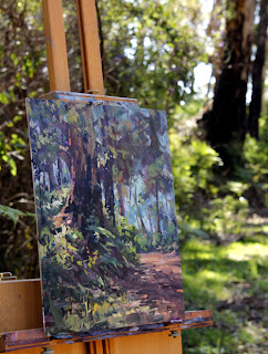
Here's the on-location photo showing the painting almost finished.

Plein air oil painting - location shot. Karri tree, Porongurup. By Andy Dolphin.

Here's the "morning after" shot.

Plein air oil painting. Karri tree, Porongurup.
Karri on the edge. 
Plein air sketch. 30x25cm oil on board. 
© Andy Dolphin
NOT FOR SALE

I did very little studio work on this, mainly adjusting a few darks and lights that had gone a little muddy in the plein-air rush. It's painted with a fairly limited palette of French ultramarine, cerulean, permanent crimson, cad yellow light and burnt sienna.

I thought I'd take this opportunity to show why photographs are often poor reference material for painting. Here's a shot I took when I began yesterday's painting.

Karri tree, Porongurup. Photo by Andy Dolphin.

Other than resizing for the blog, this photo is straight from the camera. It was taken with a Canon DSLR. It's a reasonable quality camera with a decent digital chip and, while I don't consider myself a great photographer, I do have some idea about how to use it. Professional photographers might get better results, but how many of us are professional photographers?

In the photo, everything is either green, "grey" or black. The gravel road, that was positively glowing a rich terracotta, looks dead here. The greens are almost-universally cold and vary more in tone than colour or temperature. There's no hint of the warm spring weather I was enjoying. The shadow from the tree is just a big mass of dark "something" and the sky shows barely a hint of blue.

I stood and stared at this tree for over an hour and can assure you, the photo doesn't come close to how things actually looked. Sure there's some exaggeration in my painting but I'm hardly an expressionist. The scene really was filled with colour and warmth. There was texture and detail visible in the dark lower bark of the main tree and the sunlit area at the left-hand base of that tree glowed with rich reddish earth tones - it's what caught my eye in the first place. The canopy of the distant trees was similarly bathed in sunlight - everything back there seemed to be glowing. In fact, I had to tone some areas down in my painting so they didn't compete with my main area of interest.

It's spring. If you visit the Porongurups at this time of year, you're greeted with reds, blues, yellows and pinks of wildflowers, yet the photo above gives no hint of this. It could just as easily be a clear winter's day. With a painting, we can include the colours of the spring, even if there don't happen to be any flowers visible in the exact spot we're painting.

I can adjust this photo in Photoshop to get it closer to how I remember things but, even then, it lacks useful information. To use it as a photo reference, I'd have to be inventive and to do that successfully, I'd need a lot of experience with the subject matter. And if I didn't look at the photo until month after I took it, would I even remember what caught my eye on the day? History suggests to me that I wouldn't.

In short, if you can possibly get out and paint on location, do it. It doesn't matter if the individual paintings fail (I did another one after this that I scraped off as soon as I got home). What matters is experiencing nature first hand.

Thursday, October 4, 2012

Plein air to studio

This seascape began life as a plein air oil painting and was finished off in the studio.

seascape near Albany, WA. Oil painting by Andy Dolphin
(In the bay. 35x25cm oil on board. © Andy Dolphin)
SOLD

You can read a little more about it in a previous article - plein air seascapes; still going - and note that I've taken it to a finished stage since that post.

It is now framed and hanging in my exhibition at West Cape Howe Wines.

Exhibition and a win

Two big stories for this blog update so I'll have to choose which one to mention first.

I'll make a decision and start with my exhibition.


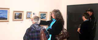
The joint exhibition with Sue Hartley opened at West Cape Howe Wines last Thursday night. It was one hell of a day leading up to it. It was cold (snow was predicted on the nearby Stirling Range), wet and windy. So it was a great surprise to see people take the drive out of town to attend.

A couple of red dots got the evening off to a nice start and everyone enjoyed the log fire, the food and the new-release wines that were on offer.

Thanks to West Cape Howe and to everyone who came along and made it a great night.

The exhibition is part of the Southern Art & Craft Trail which includes exhibitions right across the Great Southern.

In other news, I took out first prize at the 2012 Plantagenet Art Prize with my studio painting Knight's Canola.

Artist, John Greeuw and Andy Dolphin

That's me, on the right, with judge John Greeuw. And here's the painting...

Knight's Canola 

37x50cm oil on board.  
© Andy  Dolphin
SOLD

I want to thank the Plantagenet Shire for their continued support of the annual event and the Plantagenet Arts Council who put in a lot effort to get the exhibition together. There's some great work on show, including a wonderful exhibit of art from students of Mount Barker Community College and an amazing display of fantasy pieces from the local pottery group.